Communicating with diners in a digital age
Leveraging technology for better hospitality
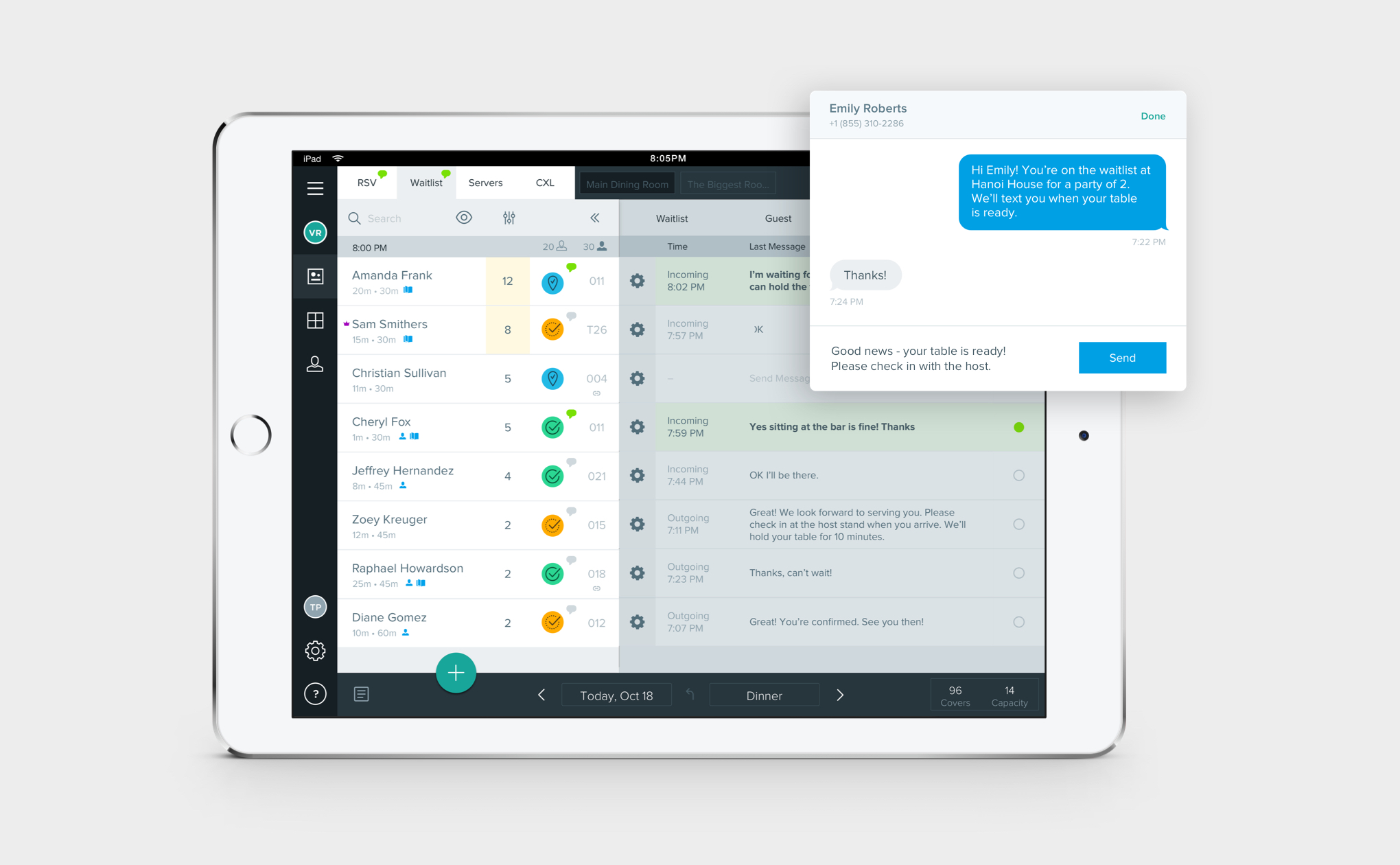
Reserve’s B2B product helps restaurants run their operations smoothly. Accompanying the host at the host’s stand, it acts as a playbook of sorts for each shift.
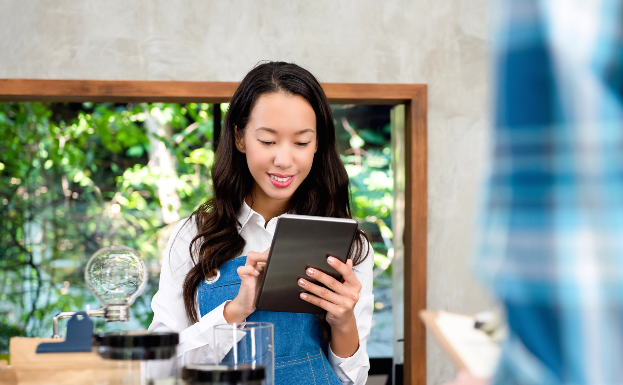
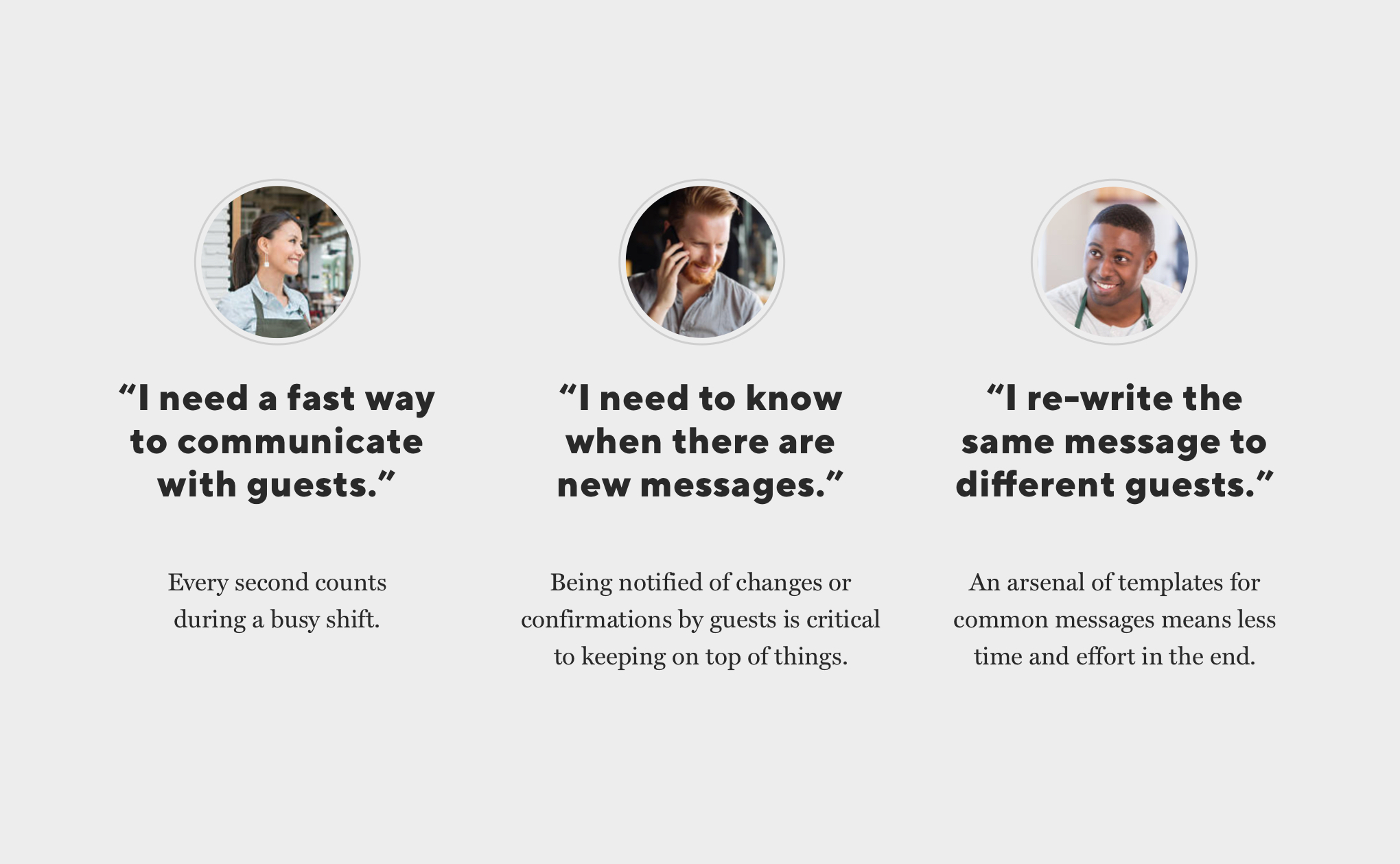
We heard from many restaurants that they wanted a quick way to communicate with their guests during service. The biggest need came from restaurants with long wait times because they need to reach guests about their spot on the waitlist, or when a table opens up.
As lead designer for our B2B product, I led the charge for enabling back-and-forth messaging between restaurants and guests:
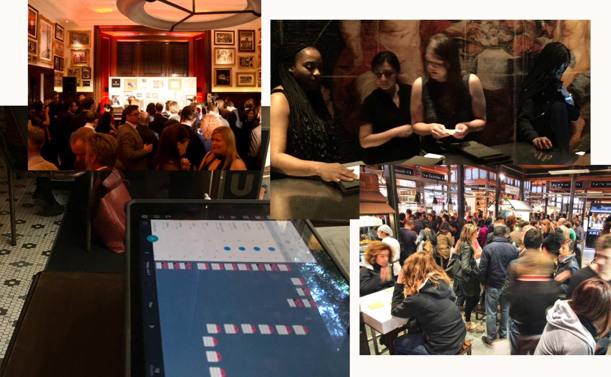
I first wanted to speak with restaurants who text guests using other products. My goal was to understand how they currently use texting and how their current system meets (and doesn’t meet) their needs. I led interviews with restaurant hosts, maitre d’s, and general managers because they’re the people who communicate with guests the most.
Our team learned a lot from these conversations–like the fact that some restaurants have more than 1,000 people walk through their doors over the course of a single night! We also heard about some common needs:
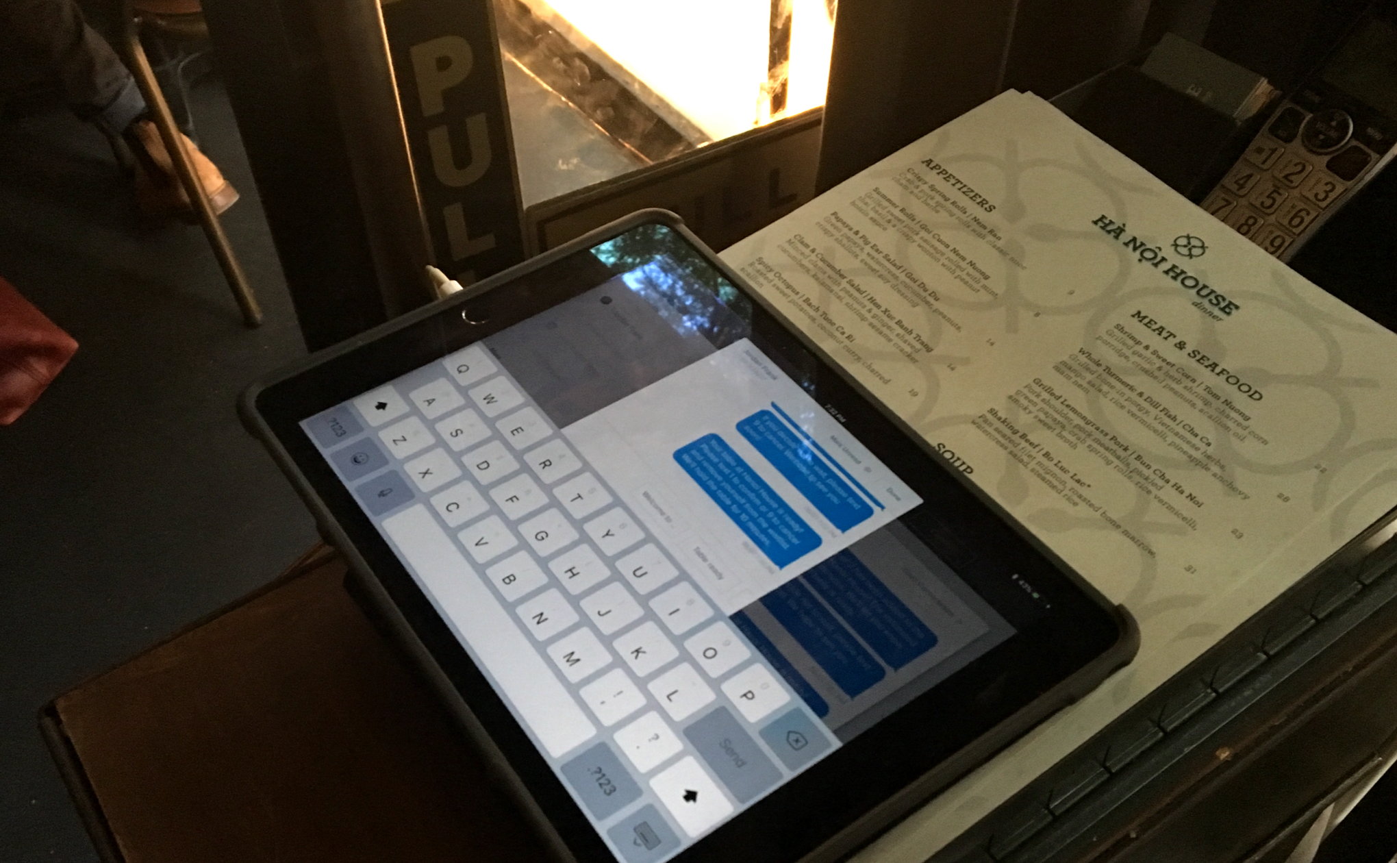
We also visited restaurants that run long waitlists to observe how they communicate with guests in real time. One of my major takeaways was seeing how painful answering the phone was during service, as well as how frustrating it was hunting through a bunch of content to find and read text messages from guests. I would use these learnings to design a more user-friendly experience.

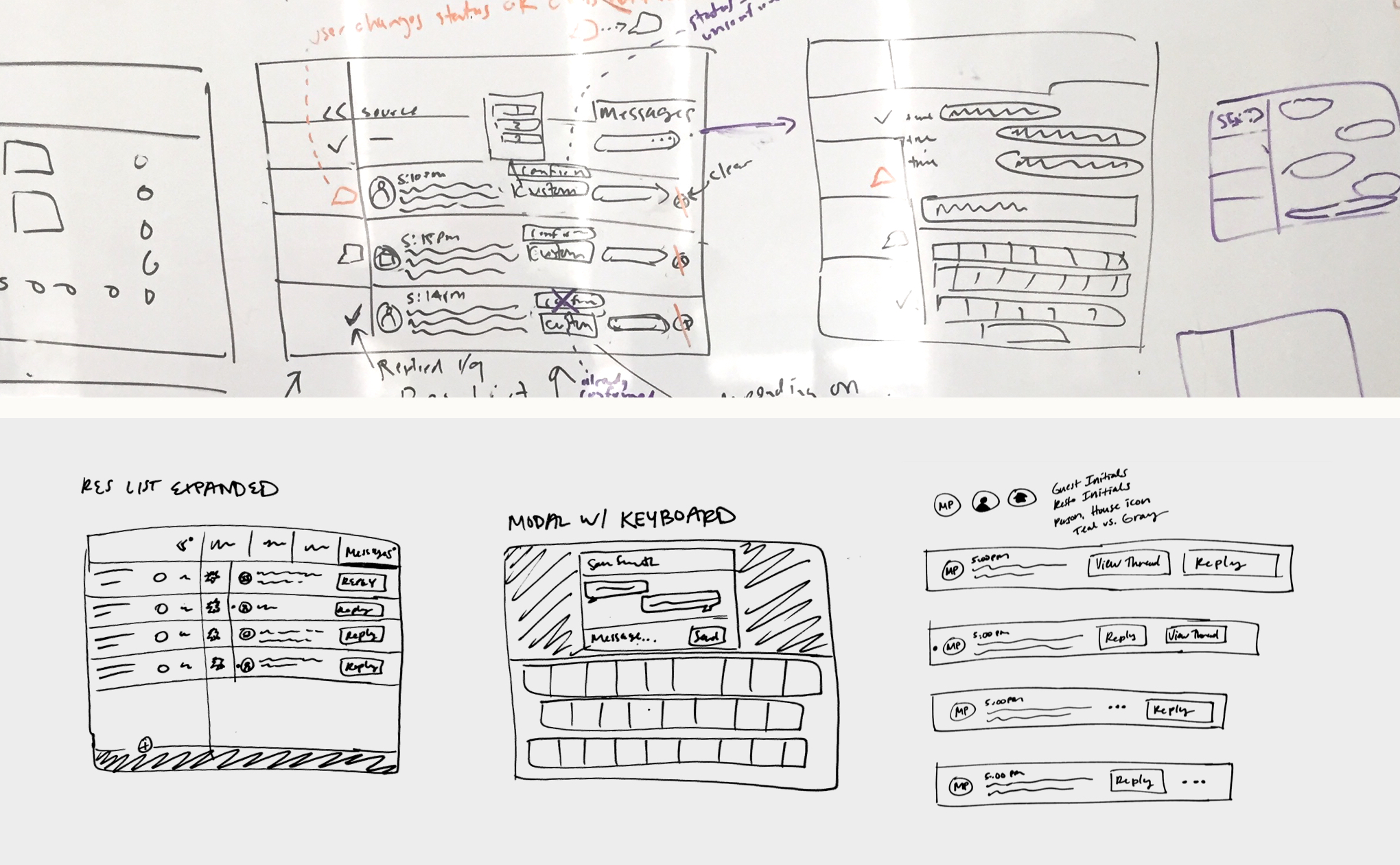
We then took all of our research and put ideas down on paper.
I roughly started sketching how this feature would fit into the current product. The main functionality we needed to consider is the restaurant sending a text, receiving a text, and responding to a text. We reviewed the sketches as a team and then I made revisions based on what we had heard from users.
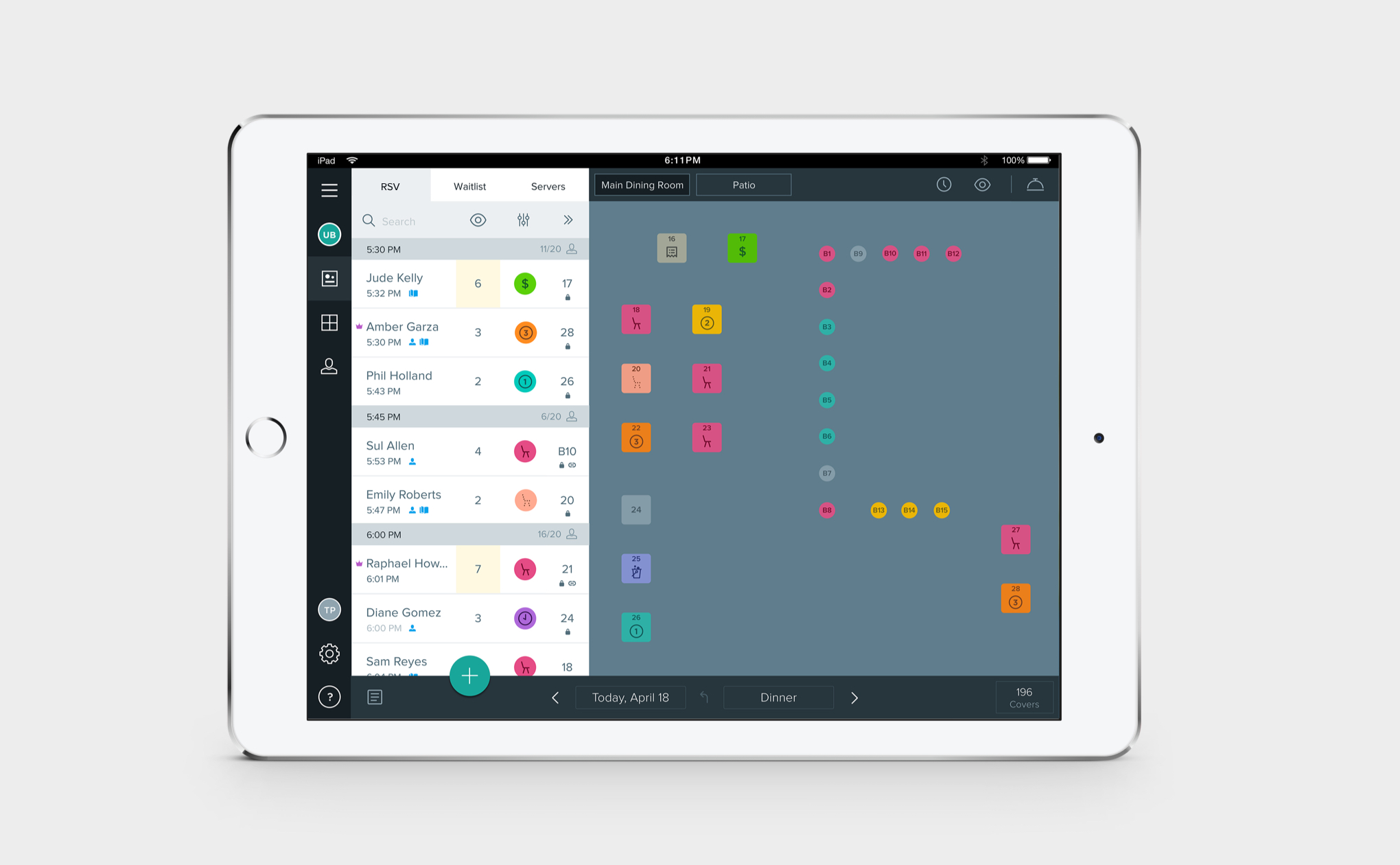
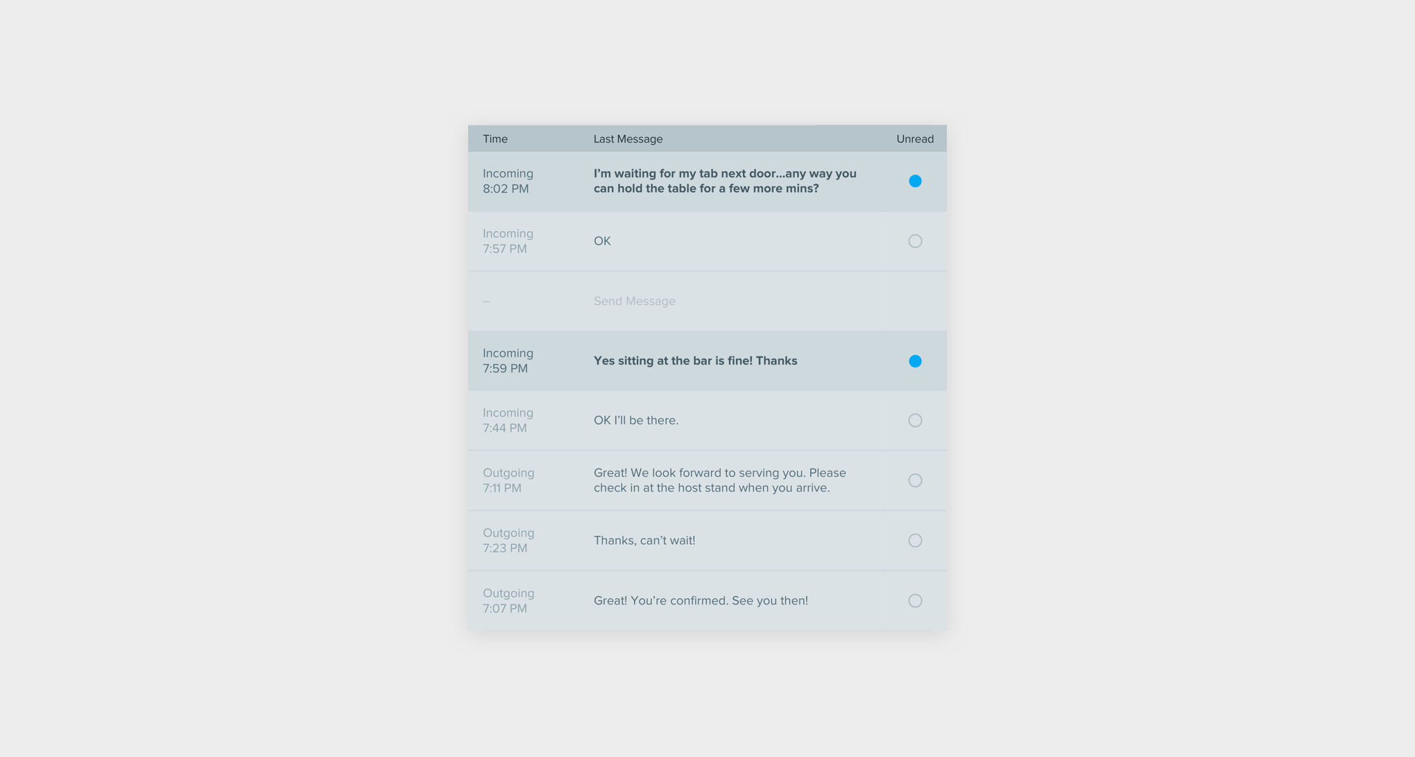
A big challenge we needed to solve was how to give users quick access to these messages without overtaking the most important view of the app. Hosts spend 95 percent of their time looking at the floor plan view, since it gives them the information they need to decide what to do next–seat a party of four in the corner booth? Re-arrange tables for a reservation coming in soon because their original table just ordered appetizers?
We considered having an alternate state on the list of waitlist guests for messages that users can flip back and forth between, but we were worried users would lose the overall picture of that particular waitlist party when it was replaced by a message (such as the number of people, time already waited, special requests, etc.).
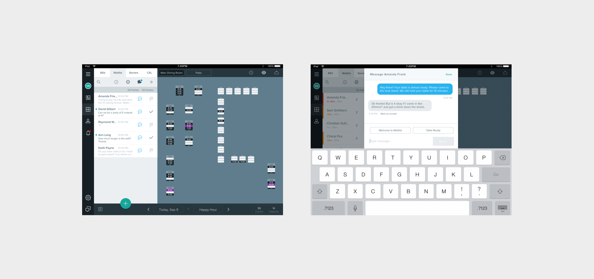
Another option was to extend the list of waitlist guests in a drawer-style using a swipe interaction. This would provide plenty of space for the messages and the details of each waitlist party, while still only being a quick swipe away from the floor plan.
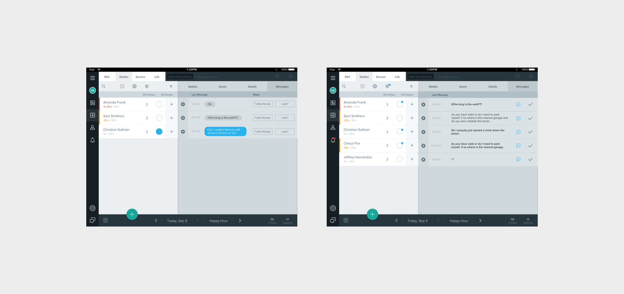
I created prototypes for our next round of testing so I could take users through the actual flow of sending and receiving messages.
Testing showed us that the ‘drawer’ direction was strongly favored–our assumption was correct that the details of each waitlist party were just as important as their message. Users also had some suggestions to make the experience work better for their needs:
This taught us the actual message content was most important. We took out some of the functionality that wasn’t as useful so users can now see a full message worth in one swipe.
We learned a lot about a message’s status once it is read. Rather than manually marking a message ‘Read’ like we had originally imagined, users preferred having messages be ‘Read’ automatically after they are seen–since this was the more common scenario–and leaving it up to the user to mark it ‘Unread’ as needed.
If a host sees a new message but needs to turn their attention elsewhere, they can quickly mark the message ‘Unread’ and find it easily when they return.
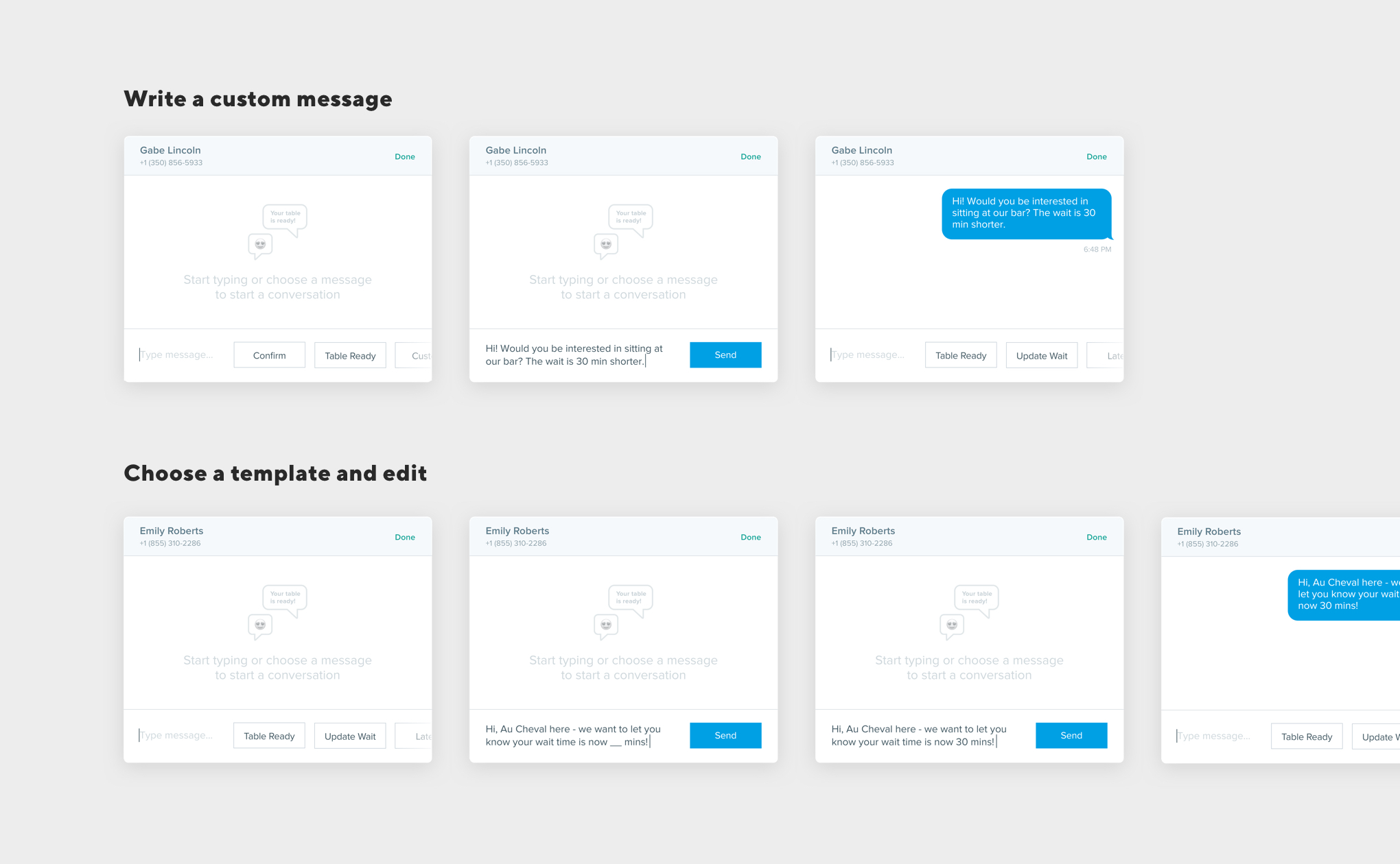
Another learning was that message templates which could be sent instantly solved only part of the need. There are many times when a template would be useful if a user could add more details to it (like a guest’s name or updated wait time) before sending to the guest, so we added that into the experience.
We were also able to better understand users’ thought process for choosing message content. We originally thought users would still want to see message templates even if they started writing a custom message, but testing showed once users commit to either a template or custom message, they’re unlikely to change. This helped us decide on the interaction pattern of the text box.
Once a user starts writing a custom message, the templates are hidden, providing more room for the user’s message. And once a template is chosen, the other templates are hidden so the user can easily customize or send their chosen message.
With the user experience in a good place, I turned my focus to the UI design.
The product UI can get quite busy especially during service, so we needed to use a color that was sure to be noticed. Users responded best to a bright green, which I used for all new messages and notifications.
I also reused components from iMessage for sending texts because it was a familiar interface for our users.
We then rolled out this MVP experience to all of our restaurant partners. This gave us the chance to get even more feedback before adding anything else.
Restaurants have been super excited about this feature since its release:
Since then, our team has been visiting restaurants to see how they are using it. This has already helped us improve the experience to make it even better. Stay tuned for more!
Nick Brown – Product Director
Sarah Surrette – Product Designer
Peter Esmond – VP of Customer Success
Zach Lindner – Product Manager
Reserve Dev & QA teams