Serving up a global dining experience
Redesigning a consumer platform for a mass market
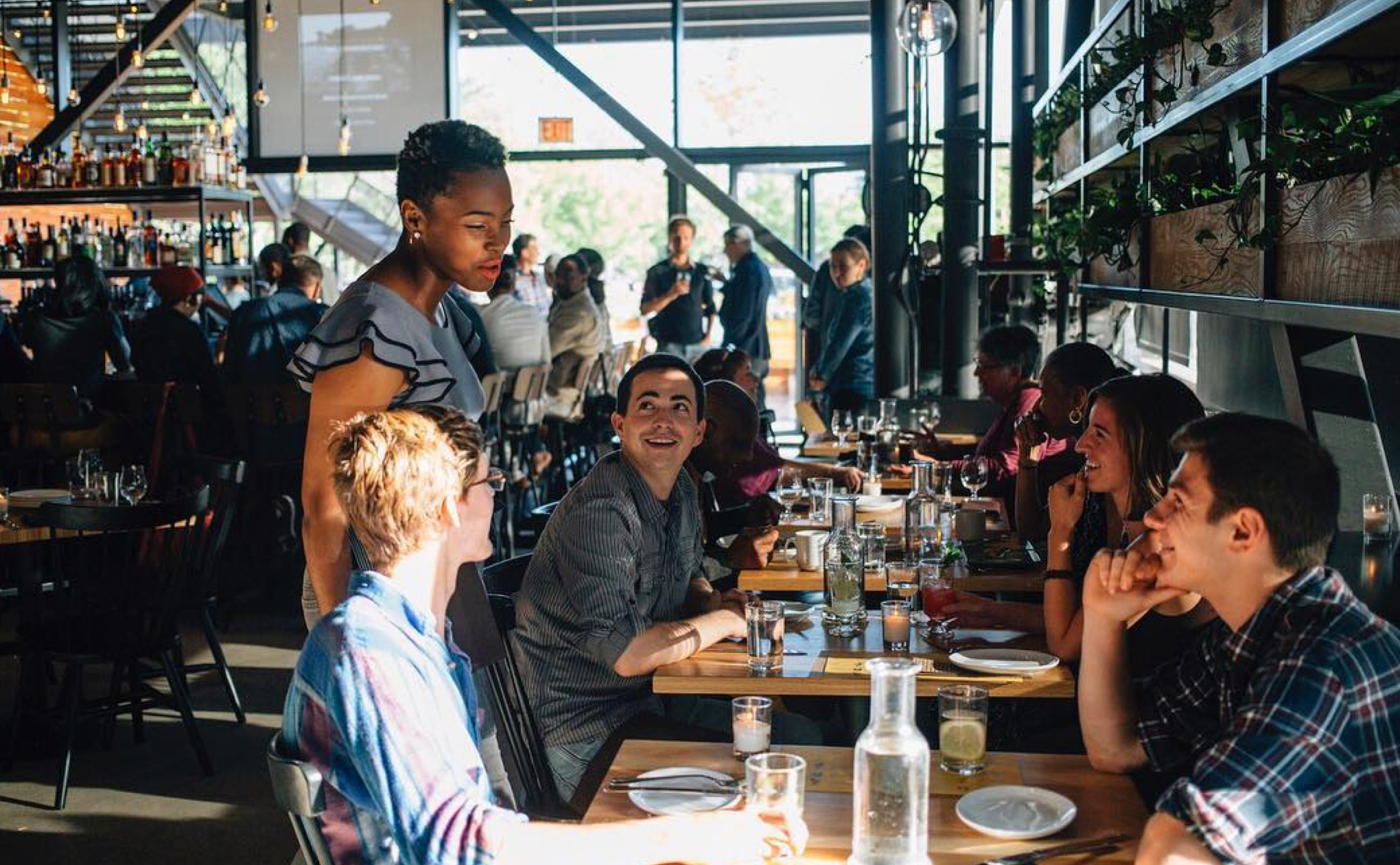
Reserve got its start by offering reservations at the top restaurants in New York City. But as the company expanded to more locations, the restaurants (and therefore diners) became more diverse. With the current experience designed for only a fraction of our users, we knew it was time for a change.
We set out to build a new experience that supported all diners. Although myself and another designer collaborated tightly throughout the project, I focused on the overall concept, user experience, and restaurant pages.

To better understand the end-to-end dining experience, I suggested we ask people to show us how they find a restaurant to go to and make a reservation. I was interested in them showing us rather than telling us so we could see exactly what they did and where they encountered frustration.
We documented the steps they took to find and make a dinner reservation for the upcoming weekend:
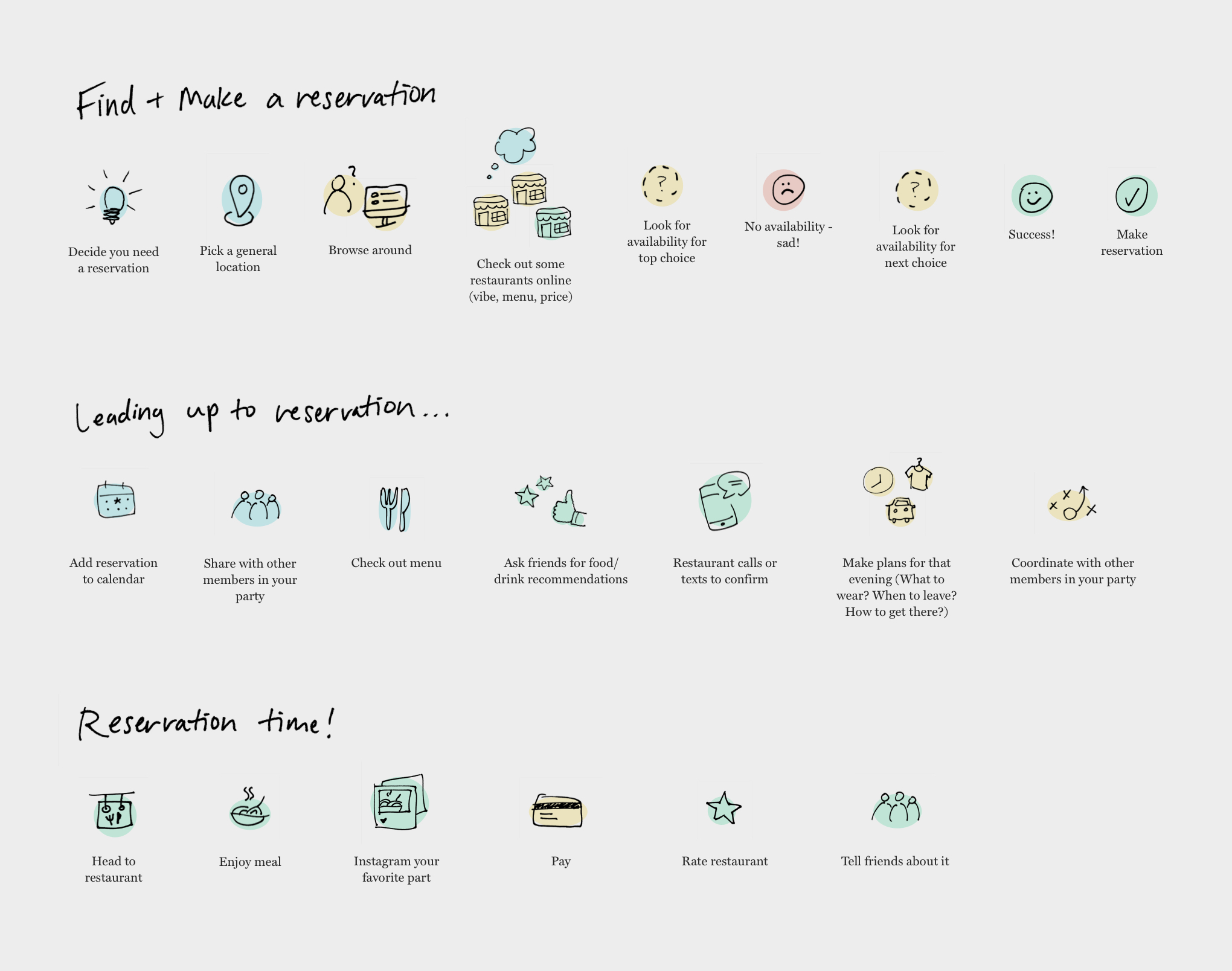
After talking to a number of frequent diners, we realized the current Reserve experience didn’t address a lot of these steps.
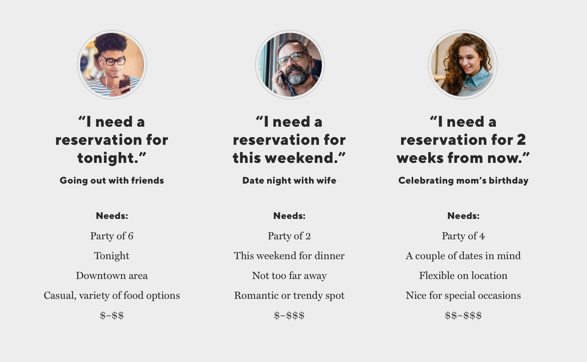
We also noticed users’ reservation needs–a certain or uncertain date, time, location, vibe, and price–differed depending on who they were dining with as well as the occasion for dining. We took note of these needs to address throughout the design process.
Perhaps the most important takeaway was the sheer excitement people felt when they were able to make a reservation at a restaurant they really wanted to go to:
This emotion shifted our perspective–instead of looking at the Reserve journey as a transactional experience, we started looking at it as a truly enjoyable and human experience from beginning to end.

The word-of-mouth theme continued to come up in user conversations, so we decided to use the idea of your go-to, trustworthy friend as our North Star.
I looked at brands that we trusted–like Casper, Google flights, Slack, and more - to see how they achieved a sense of trust. I noticed details like tidbits of helpful information at key moments, strong typography with a clear action or message, and a bit of humor here and there to help the user feel at home.
This would serve as inspiration for the new experience.

We first focused on the home page and restaurant detail page, since that’s where users will spend the most time and make decisions that impact the rest of their experience.
For these pages, we got small groups of people from different areas of the company together to do sketch sessions. Our goal was to get as many ideas down as possible.
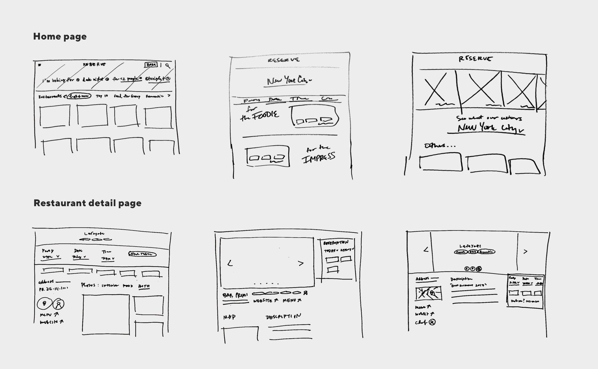
Lots of ideas came out of the sketch sessions, such as Mad Libs to learn what the user is looking for and social media photos to get a feeling for a restaurant from other diners.

The other designer and I took the ideas that resonated the most and converted them into wireframes to test with actual users. Using a mobile size forced us to start simple.
For the home page, we wanted to know if the right content was displayed so users would be interested in a restaurant. For the restaurant detail page, we wanted to know if the right content was displayed so users would want to make a reservation.
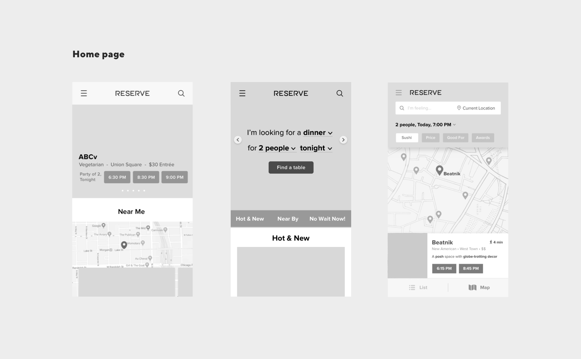
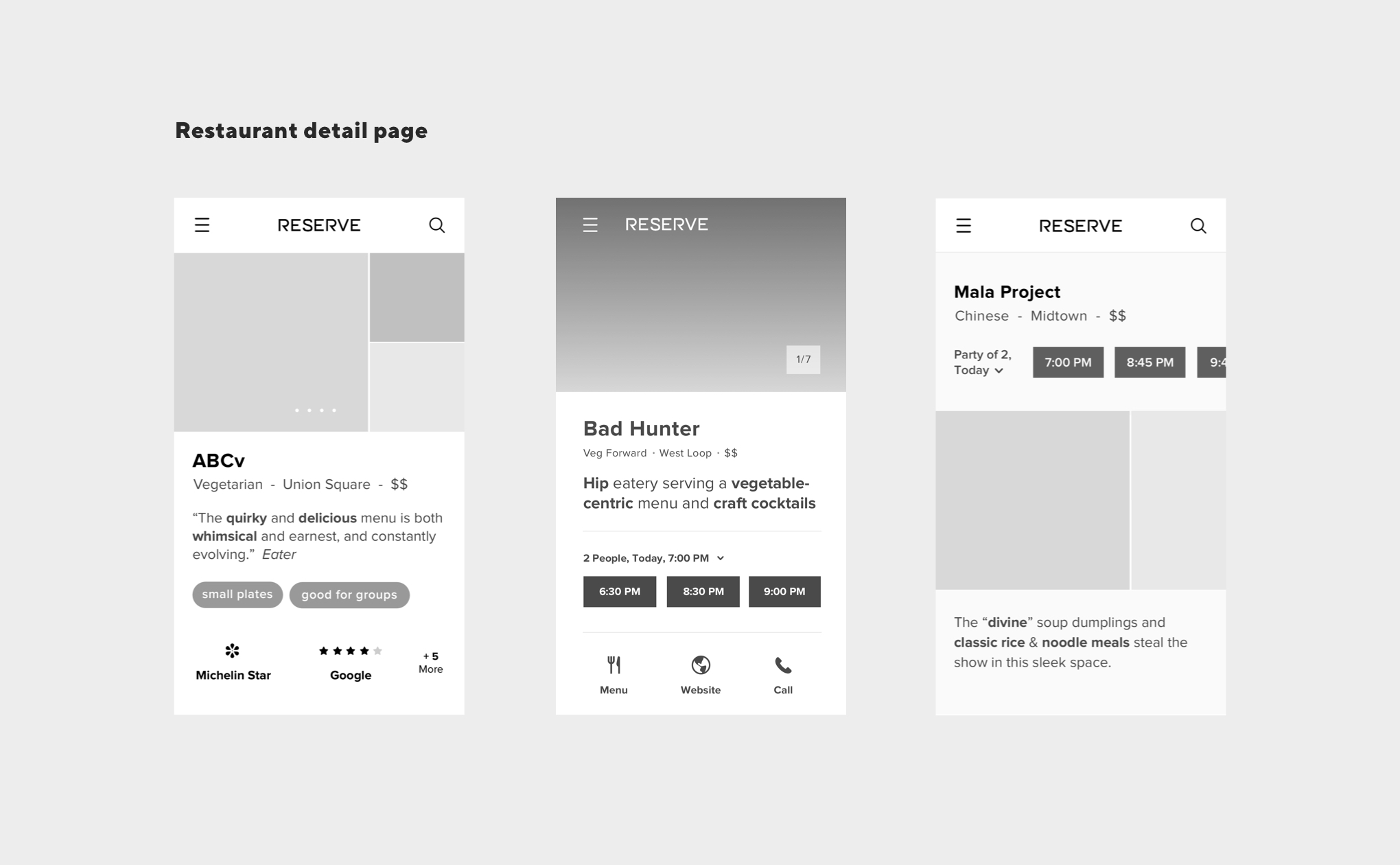
We showed prototypes to users of a variety of ages, locations, and dining habits. When in-person conversations were not possible, we used Lookback to conduct the tests.
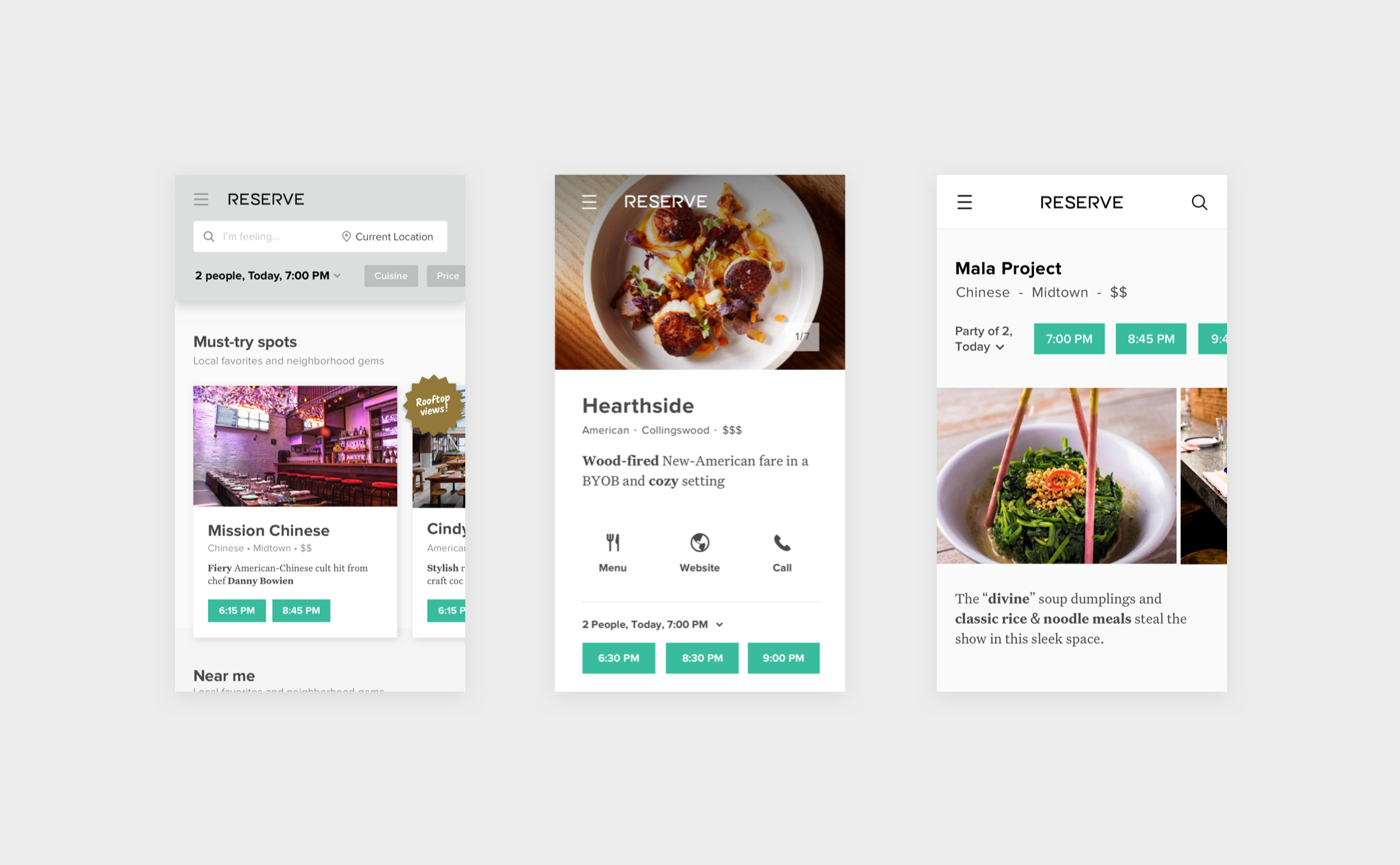
Something we discovered early on was the importance of including actual restaurant images in the prototypes, rather than gray boxes. This showed us how critical the images were in helping a user decide to make a reservation (or not).
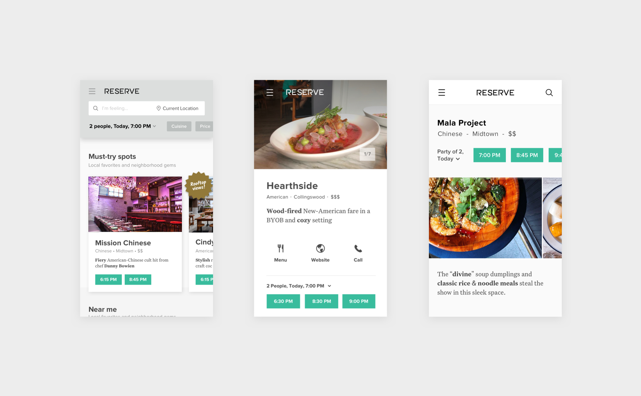
After adding images to the prototypes, we quickly realized the not-so-good photos (and therefore the restaurants) were entirely skipped over during the user tests, even for restaurants that were award-winning and highly recommended.
We knew it wasn’t feasible for restaurants to have the budget for professional photography, but their photos were actually doing them a disservice - especially when they served as a user’s first impression, like on the home page.
To solve this, our team scoured Instagram and Google to find images that were more appetizing and inviting. Even a small handful of good images made a huge difference!
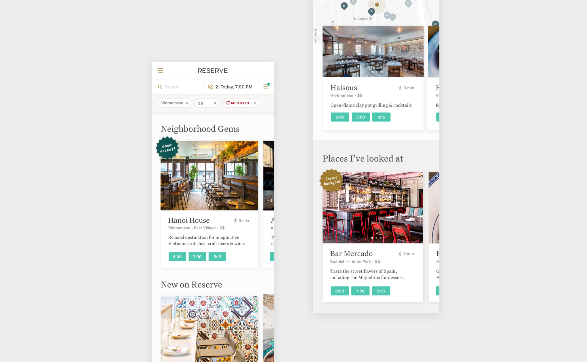
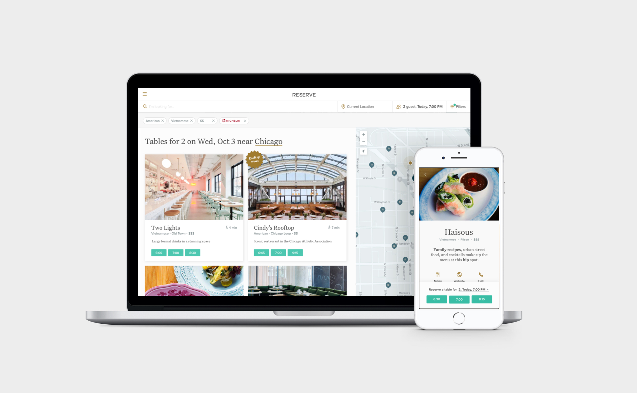
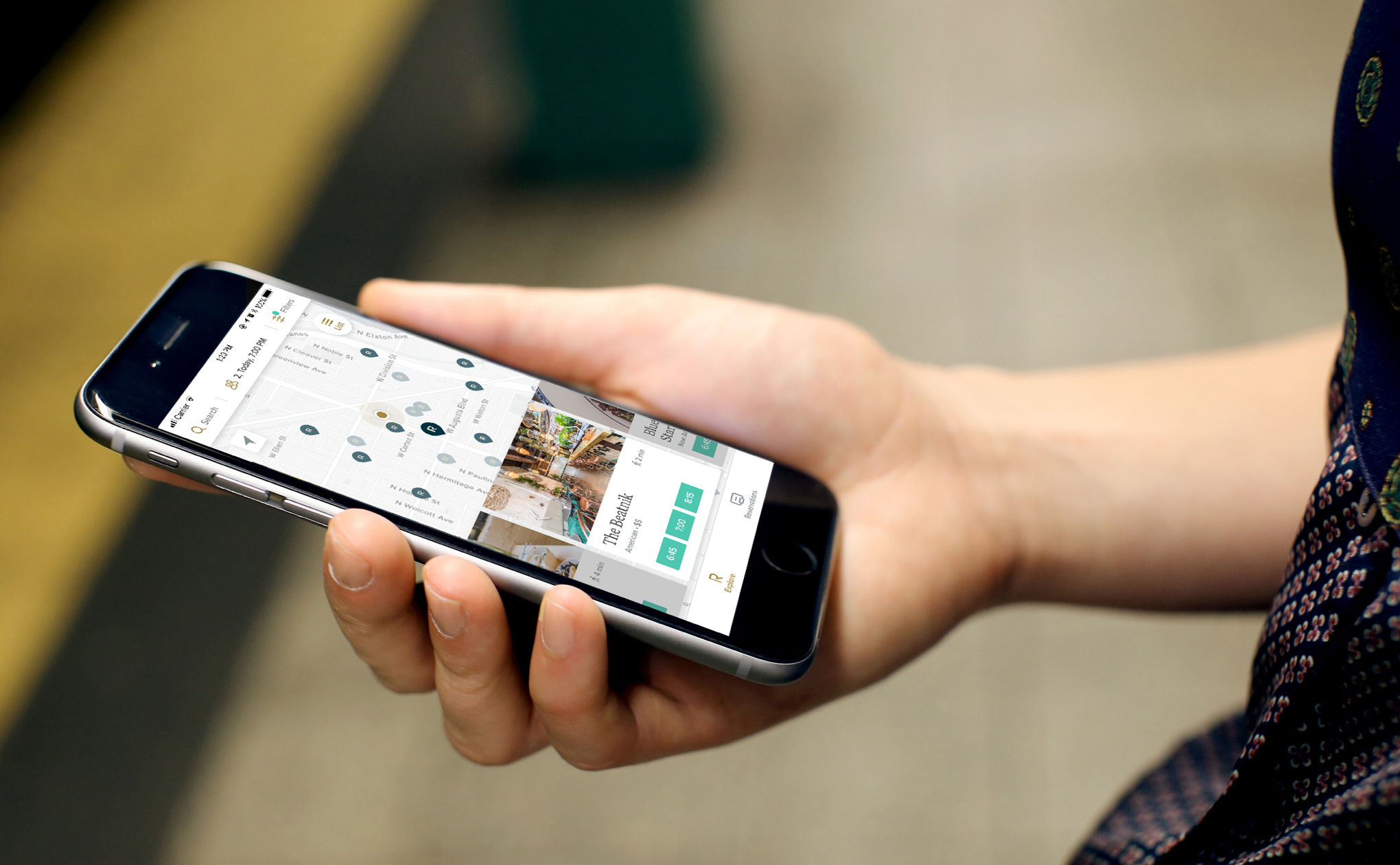
For the home page, users loved the curated lists like ‘Neighborhood gems’ and badges on the restaurant cards. It was unanimous that an interior shot was preferred for the default restaurant image in order to get a sense of the vibe right off the bat.
Making sure filters are easy to change also proved useful while searching.
Finally, users liked the “Restaurants I’ve looked at” list. This idea came to us when we heard people might look at more than 10 different restaurants before deciding on one!
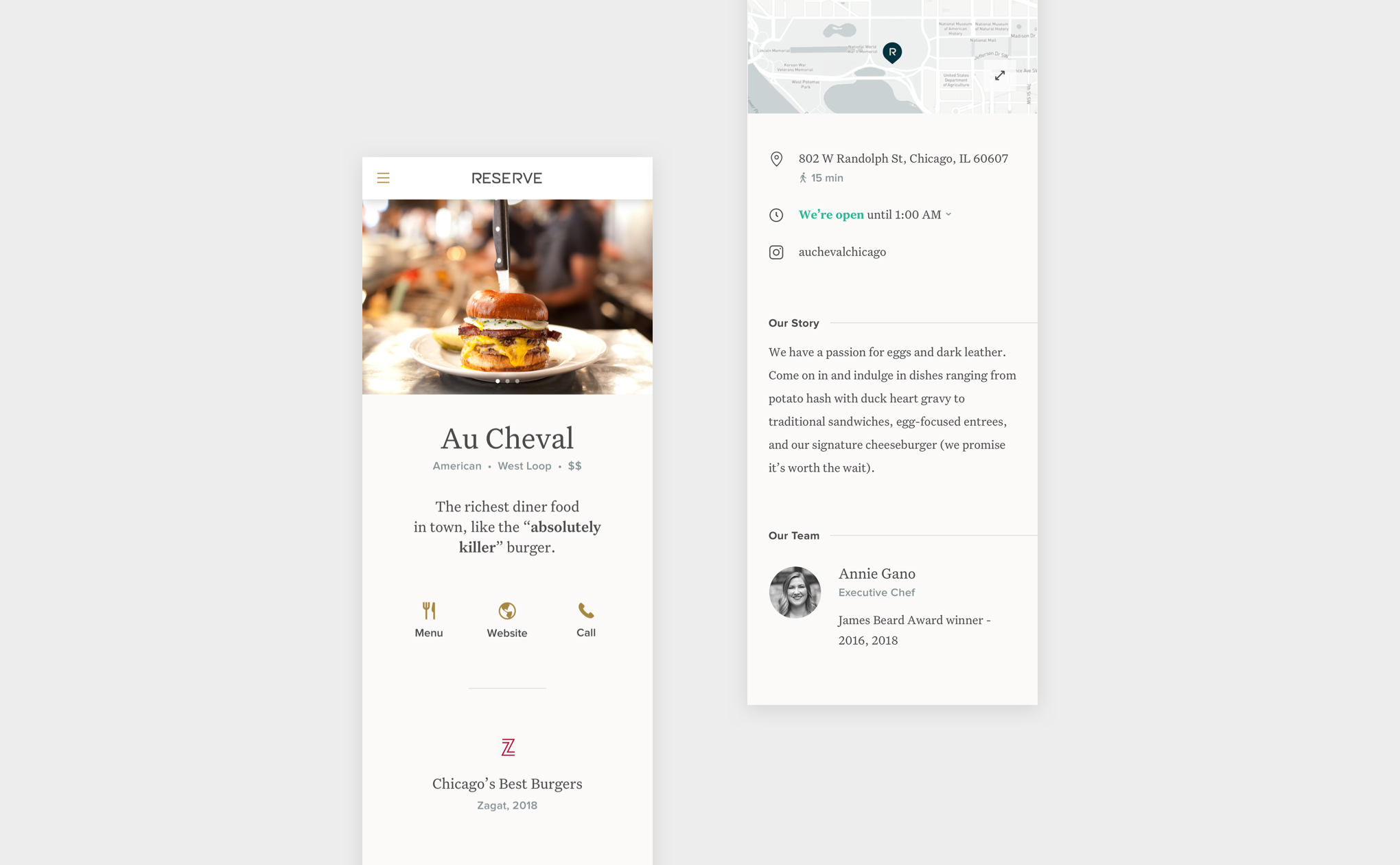
For the restaurant detail page, users liked easy access to interior and food images as well as the awards displayed front and center. They also responded well to the personable feeling of the content being written from the restaurant’s perspective, including who the chef is and their claim-to-fame.
Quick access to the restaurant’s contact, menu, and website was deemed important as well, especially on the phone.
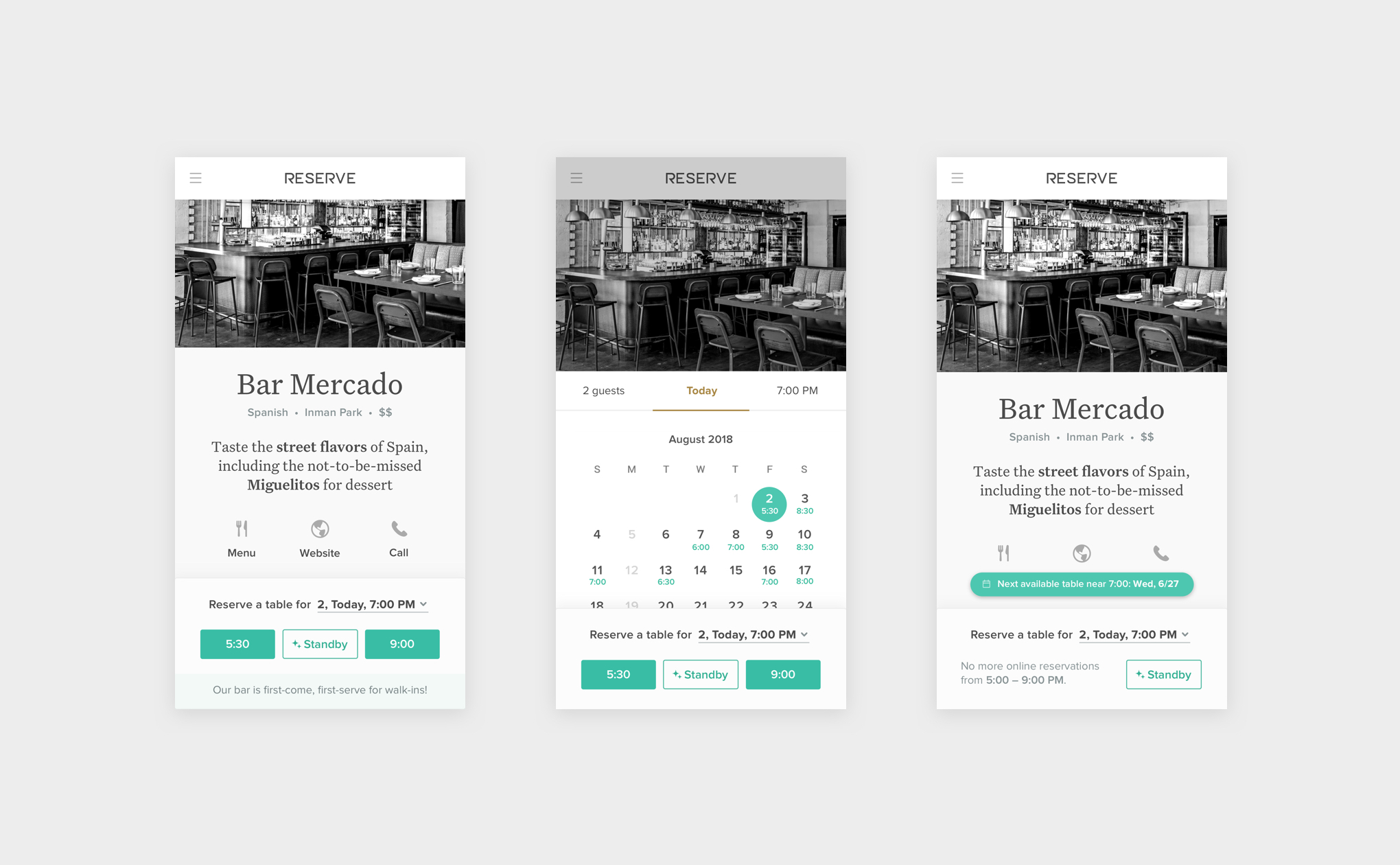
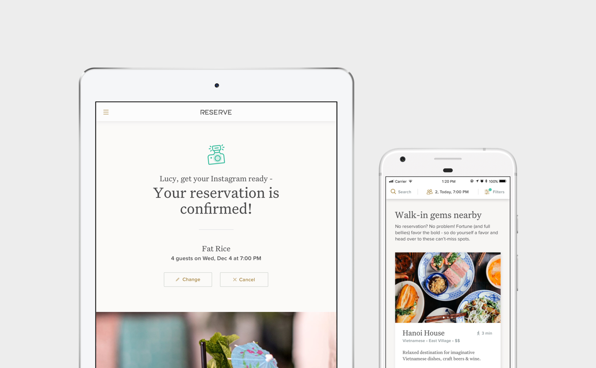
We also took users through the scenario of not being able to find a reservation for a restaurant they want to go to. Where the current experience resulted in a dead end, we now showed them a variety of alternate options.
Users preferred seeing more options at the same restaurant first (such as other dates and times available, walk-in information, or being able to add themselve to a waitlist) and then seeing similar restaurants in the same area that had reservations available.
These different choices will give users the best chance to find the reservation they want, even as their needs change from one dining occasion to another.
I made improvements to the pages based on the feedback and then re-tested until we were confident with the happy path.

Continuing with the theme of trust, I added layers of information on to the core experience to help set users up for success.
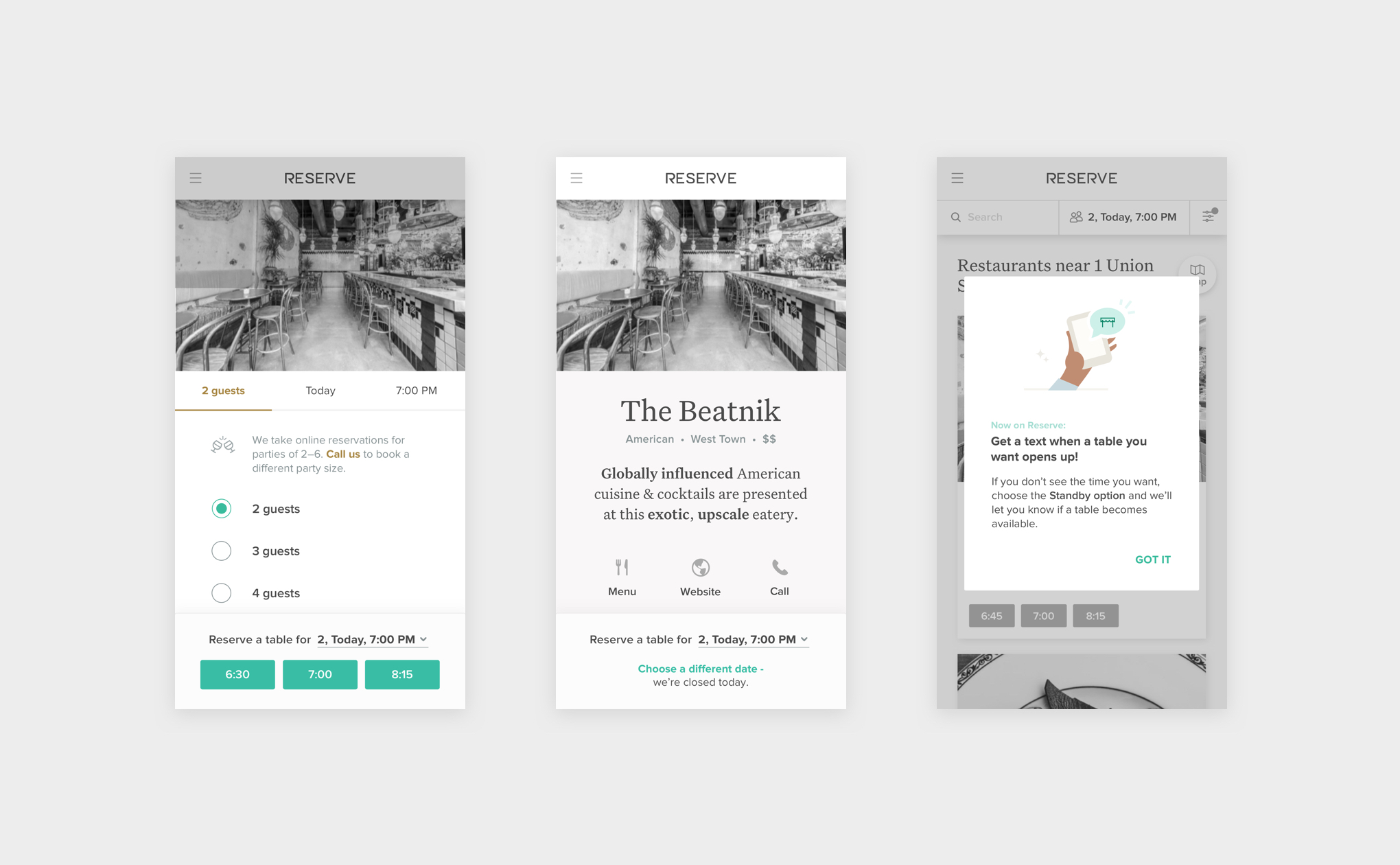

The restaurant content paved the way for the visual style. Beautiful images, large and small type, and plenty of white space invites users in to experience each restaurant. By keeping the restaurant as the hero, the interface worked well for our wide variety of restaurants, from the casual neighborhood spots to the Michelin-starred.
I chose Untitled Serif for its credible yet approachable feel. Proxima Nova is used for accents.
I also decided to have some fun with the copy, especially for the moments that called for a celebration:
Since the release of the new Reserve experience, we’re focused on supporting diners along the rest of their journey.
Reserve now serves over
1 million diners each month.
We’ve already heard a lot of positive reactions:
Google, Facebook, and Expedia have since integrated Reserve’s restaurant content with their own products, helping even more people find the perfect spot to dine.
Nick Brown – Product Director
Sarah Surrette – Product Designer
Ringo Lertprecha – Product Designer
Zach Lindner – Product Manager
Reserve Dev & QA teams
