
Empowering our neighbors with human-powered transportation
Mobilizing an organization with branding
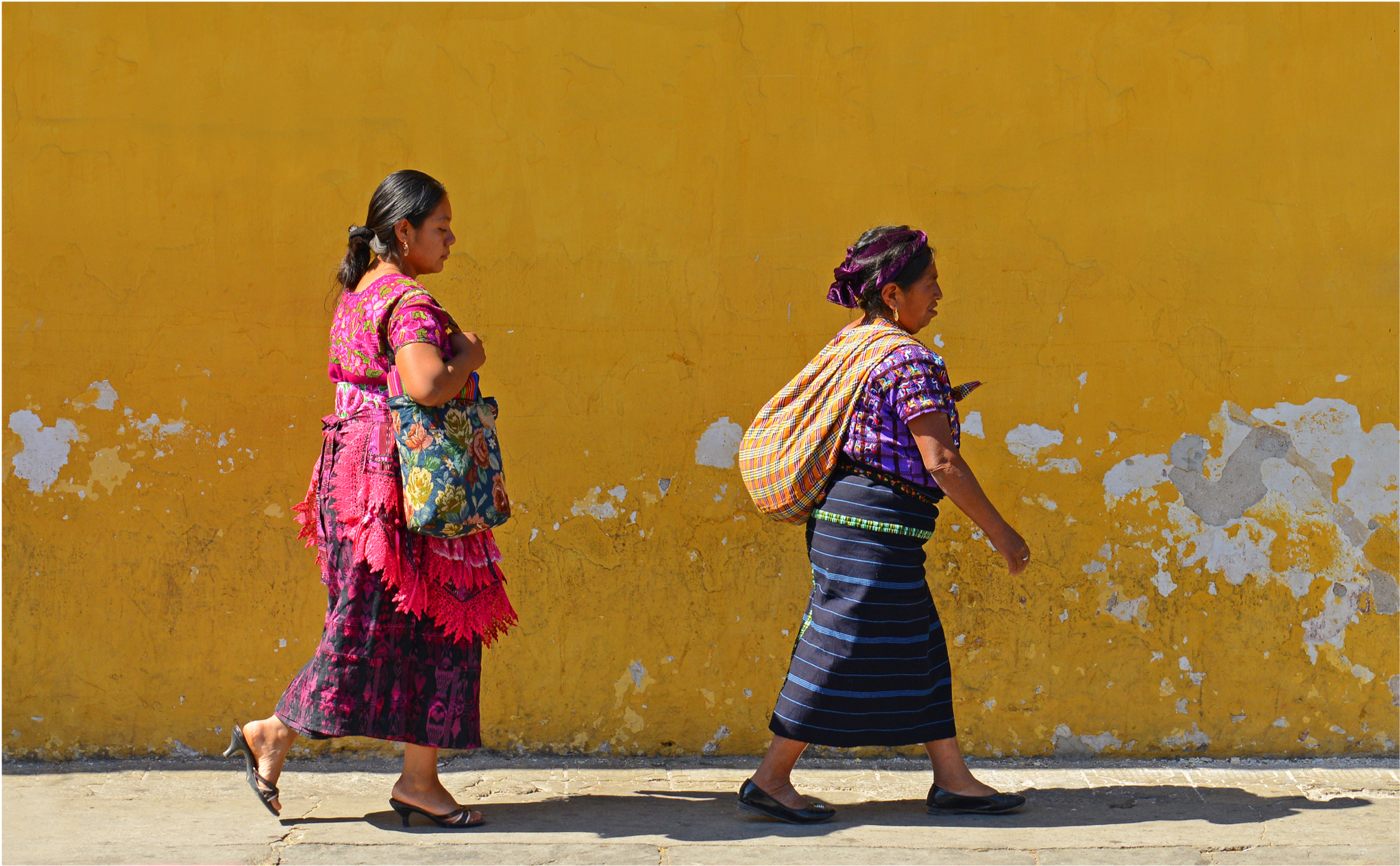
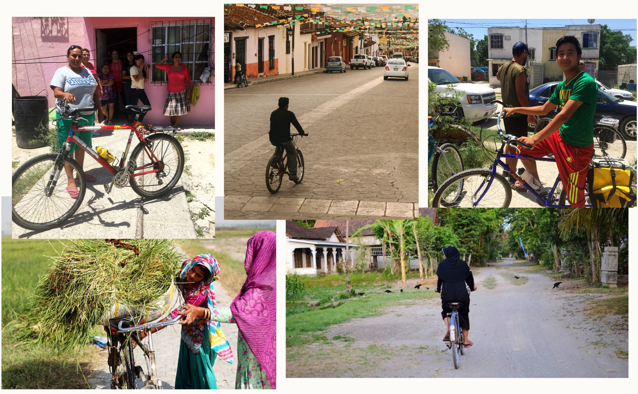
For people living in Mexico, commuting to work is a job in itself–most walk several hours a day or spend roughly 40 percent of their income taking public transportation. This limits their ability to have a good quality of life.
Bikes Across Borders believes the human-powered bicycle can help.
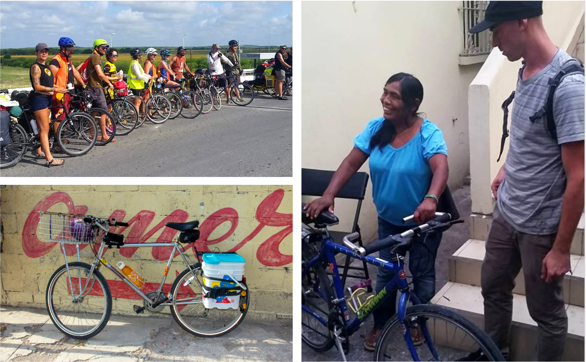
Once a year the Austin-based non-profit rides 250 miles to a rural community in Mexico, where they donate bicycles they’ve been collecting and repairing to people in need. These bikes help make the previously impossible possible–whether it’s being able to take a farther, higher-paying job to better support their family or return home earlier to take care of their children.
Bikes Across Borders was in need of a bold identity to share their mission with the world. I decided this would be a great project to take on as part of my undergraduate work at The Tyler School of Art.

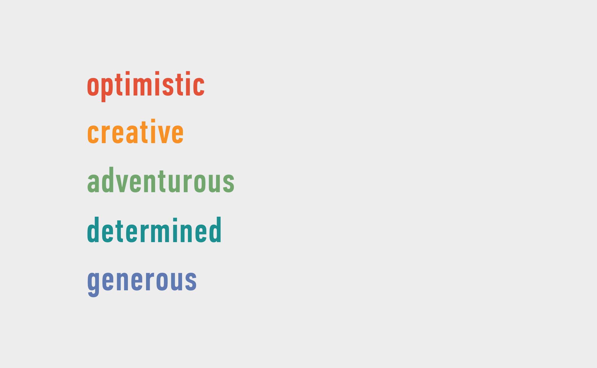
To start, I learned more about the organization and their needs. From the research and conversations I had, I wrote down a list of adjectives that embody the incredible people behind this cause. This would become my vision for the brand:
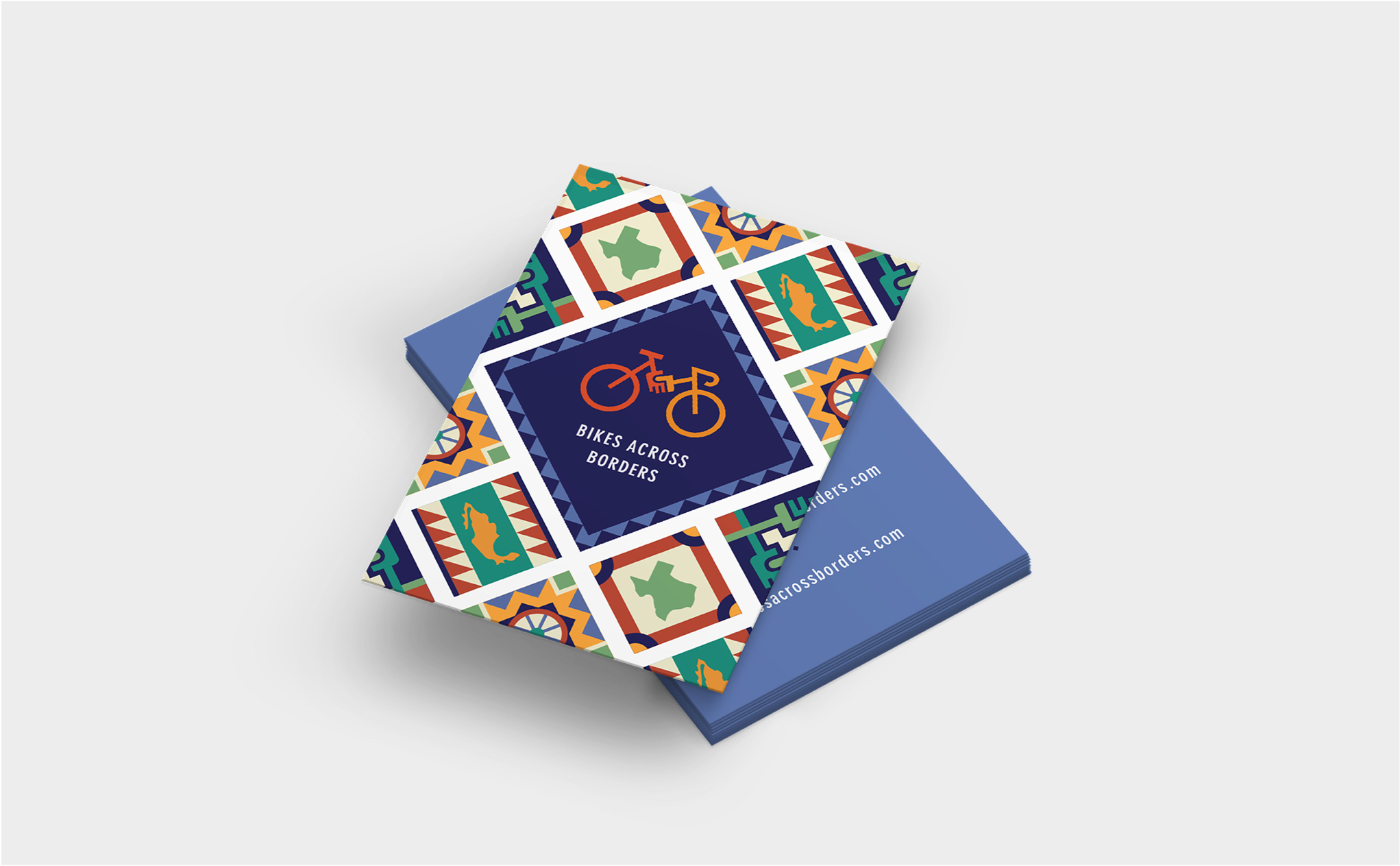
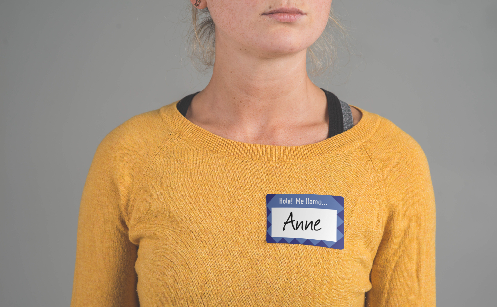
For the logo, I considered the different aspects of Bikes Across Borders to represent. I ultimately focused on the ‘what’ and the ‘why’ behind the organization to tell their unique story. After dozens of ideas, I landed on a mark that felt just right–an image of outreached hands juxtaposed within a bicycle.
For visual inspiration, I looked to Mexico’s vibrant culture. I was blown away by the rich colors, patterns, and decorative details, all of which I would use to bring the logo and brand to life.
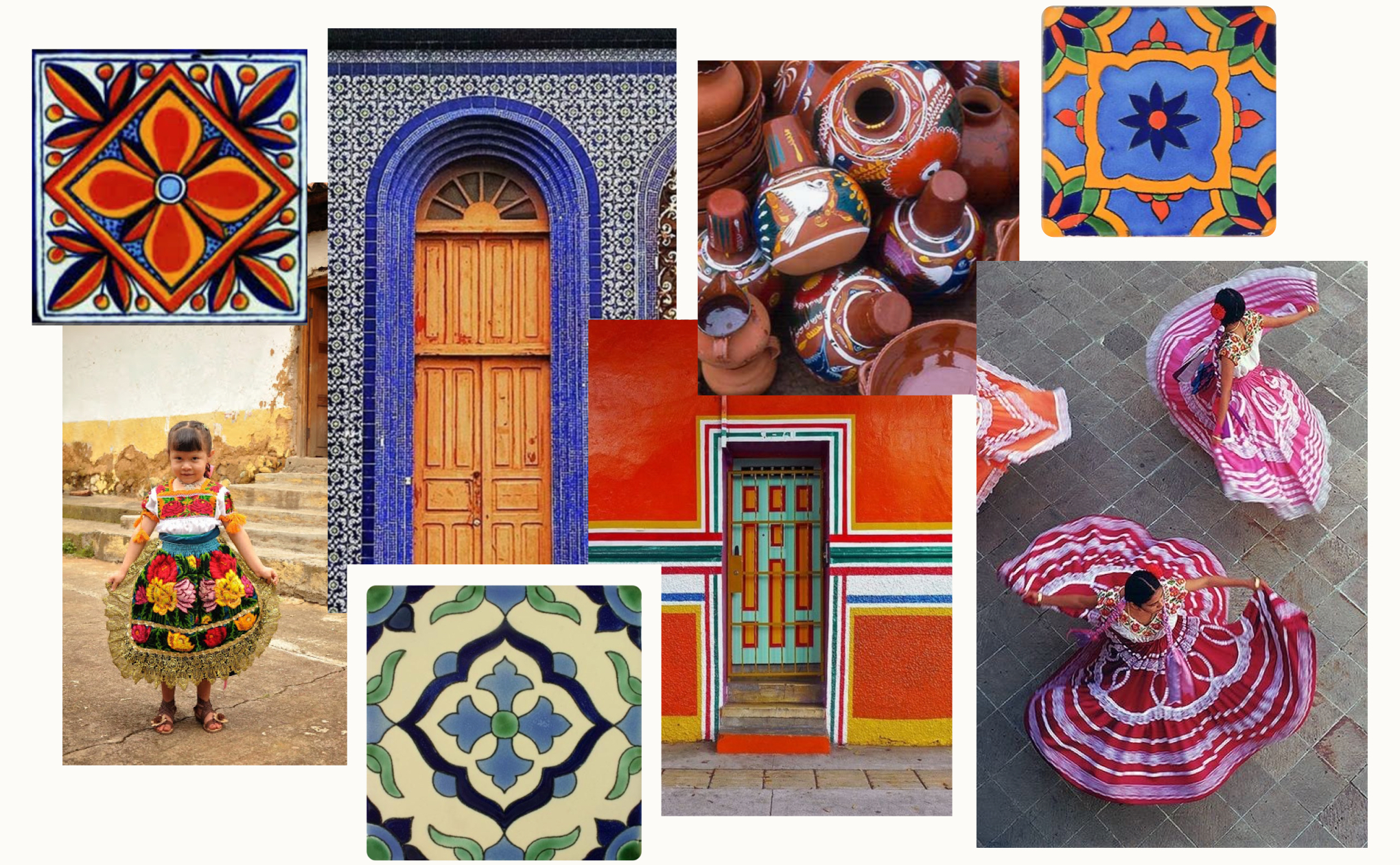
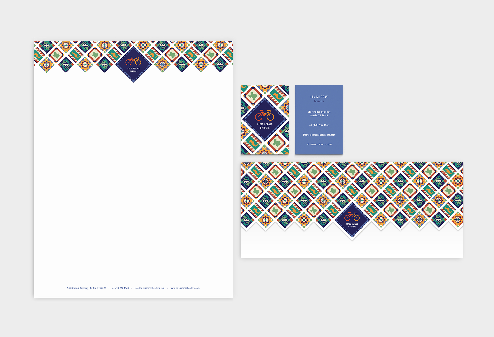
One of the elements that caught my eye were the ceramic tiles, which are an important part of Mexico’s culture. These unique tiles would be a great way to express the creative nature of the organization. It was also a perfect way to finish the logo.
For the stationery, I used the tile designs to create a pattern around the logo. In searching for a typeface, I looked for something simple that would complement the bold visual style. I chose to go with the condensed version of DIN Neuzeit Grotesk for the balance its letterforms created with the geometric illustrations.
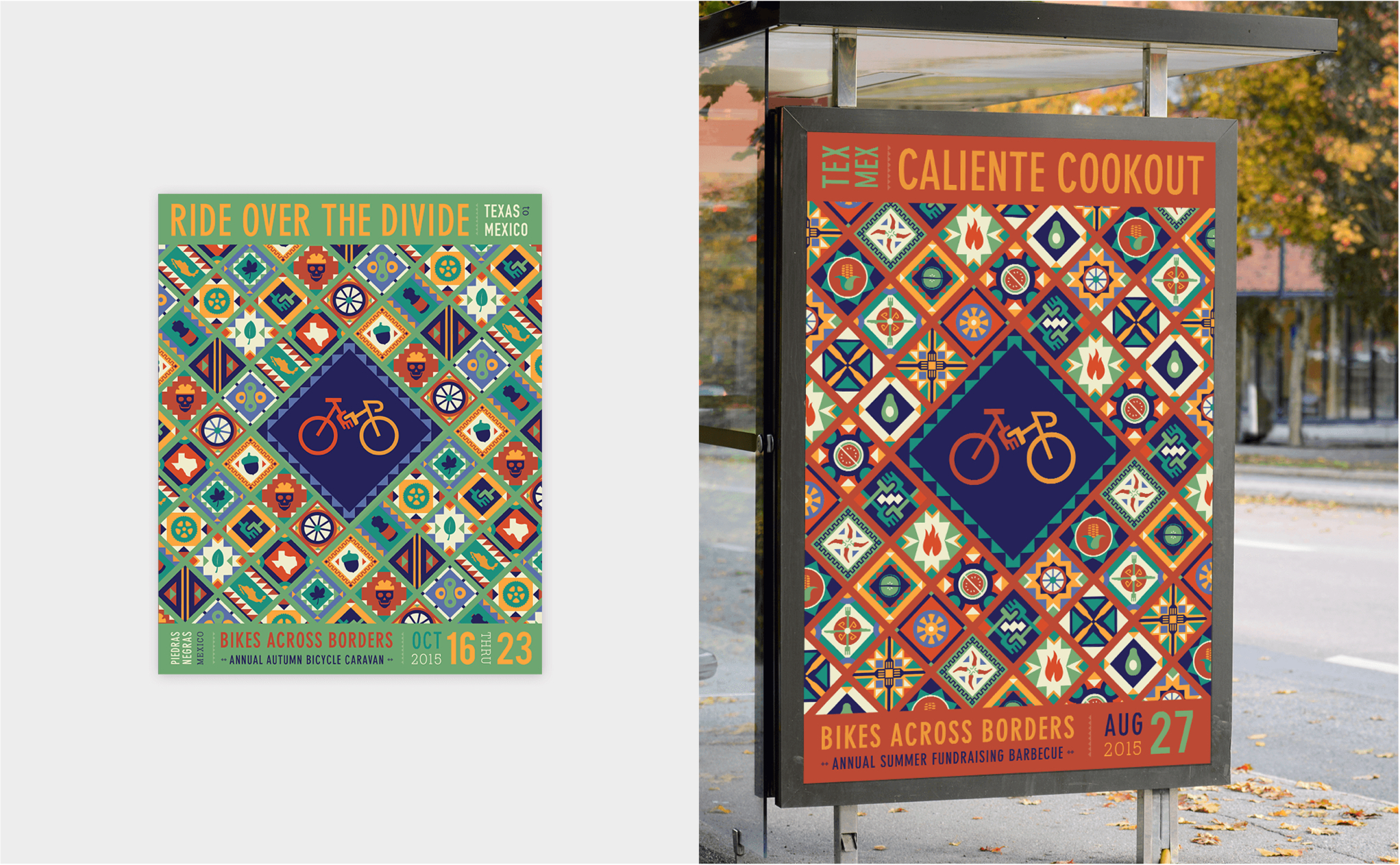
I also created posters for the events Bikes Across Borders hosts each year to prepare for their ride to Mexico. The tile patterns were a fun way to illustrate the type of event being promoted, whether it was a fundraising cookout, bike ride, or DIY bike repair workshop. I felt the posters should be full of energy to reflect the spirit of the organization and get passersby excited about joining a great cause.
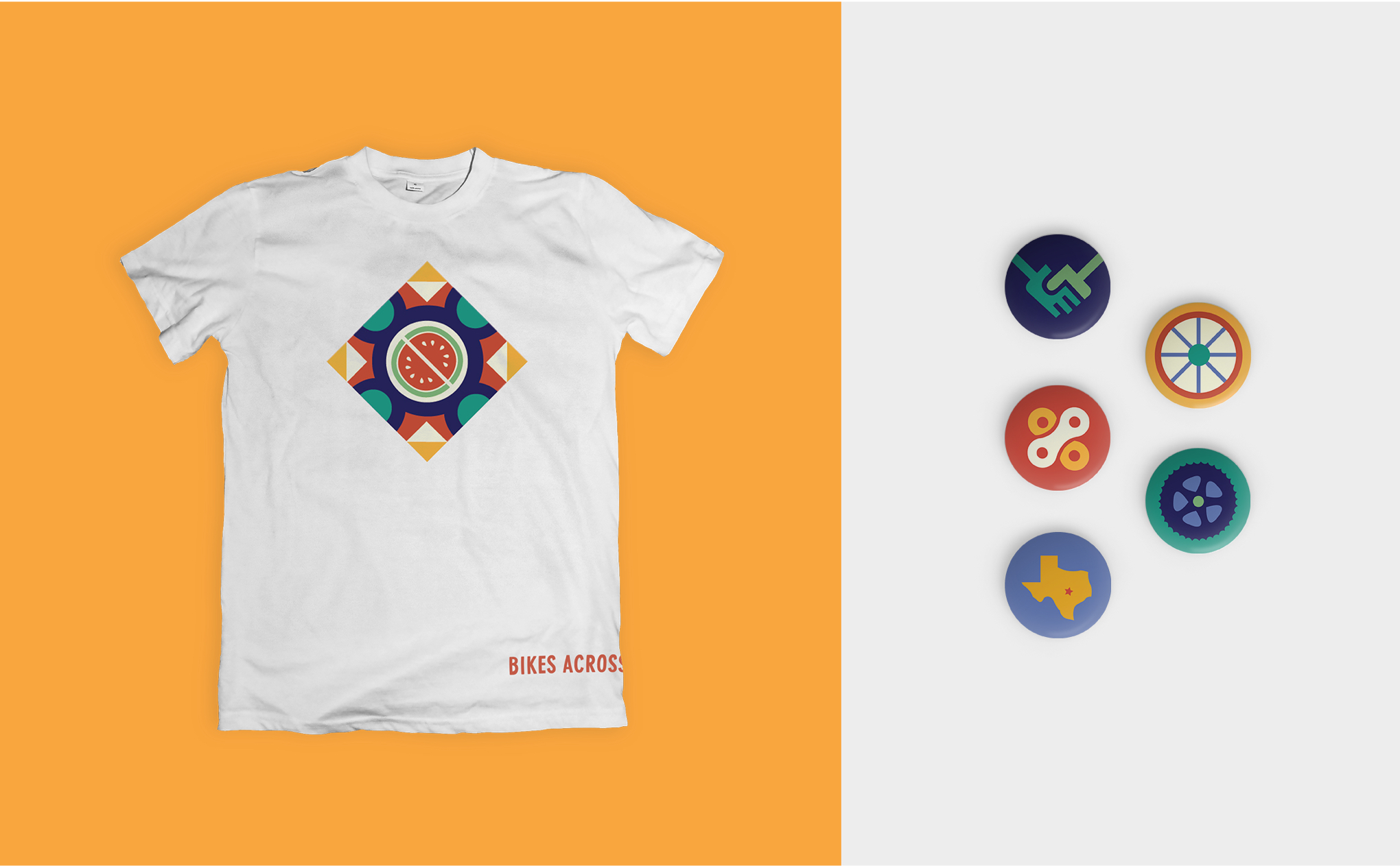
Along with the posters, I designed other materials the organization would need. Using the illustrative icons and bright colors in different ways across the materials kept the brand cohesive but still exciting.
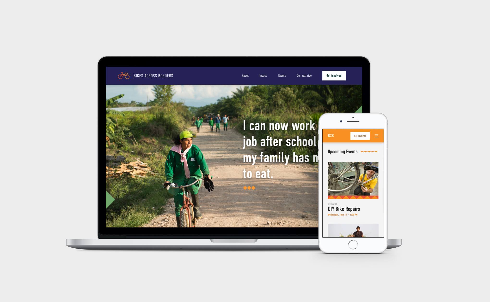
When it came to the website, I thought about the different people who would be using it–locals looking to join? Supporters wishing to donate? Members wanting to participate in an upcoming event?
I considered their reasons for visiting the site and the type of content they would want to see. I kept coming back to the idea that understanding this organization’s impact would be incredibly important to earning outside support. Bikes Across Borders members do what they do to improve the wellbeing of others. What better way to show this than to share the stories of the people whose lives they changed?
What started as a student project turned into a collaboration with the organization.
To date, Bikes Across Borders has successfully organized 17 bike caravans, providing almost 1,000 people the freedom of autonomous transportation.
Alice Drueding – Art Director
Sarah Surrette – Brand & Identity Designer
Joshua Collier – Bikes Across Borders Founder
The entire Bikes Across Borders organization