Making every minute count–anywhere, anytime
Motivating millions to move more

It’s no secret that physical activity is crucial to a healthy lifestyle, but 80 percent of Americans don’t get the exercise they need. Johnson & Johnson decided to change this by creating the 7 Minute Workout.
The 7 Minute Workout is surprisingly simple to do but super effective. Only requiring a little bit of time each day, it’s proven to give people the movement they need and the results they want.
Johnson & Johnson approached the team at Tonic Design Co. to build a mobile experience so anyone can do the 7 Minute Workout anywhere, anytime. For this project, my focus was primarily the interface design.

We knew from the beginning that we would be designing for a wide variety of users. Our own team had very different approaches to exercise, so a product that worked equally well for all fitness levels was a challenge we needed to solve.
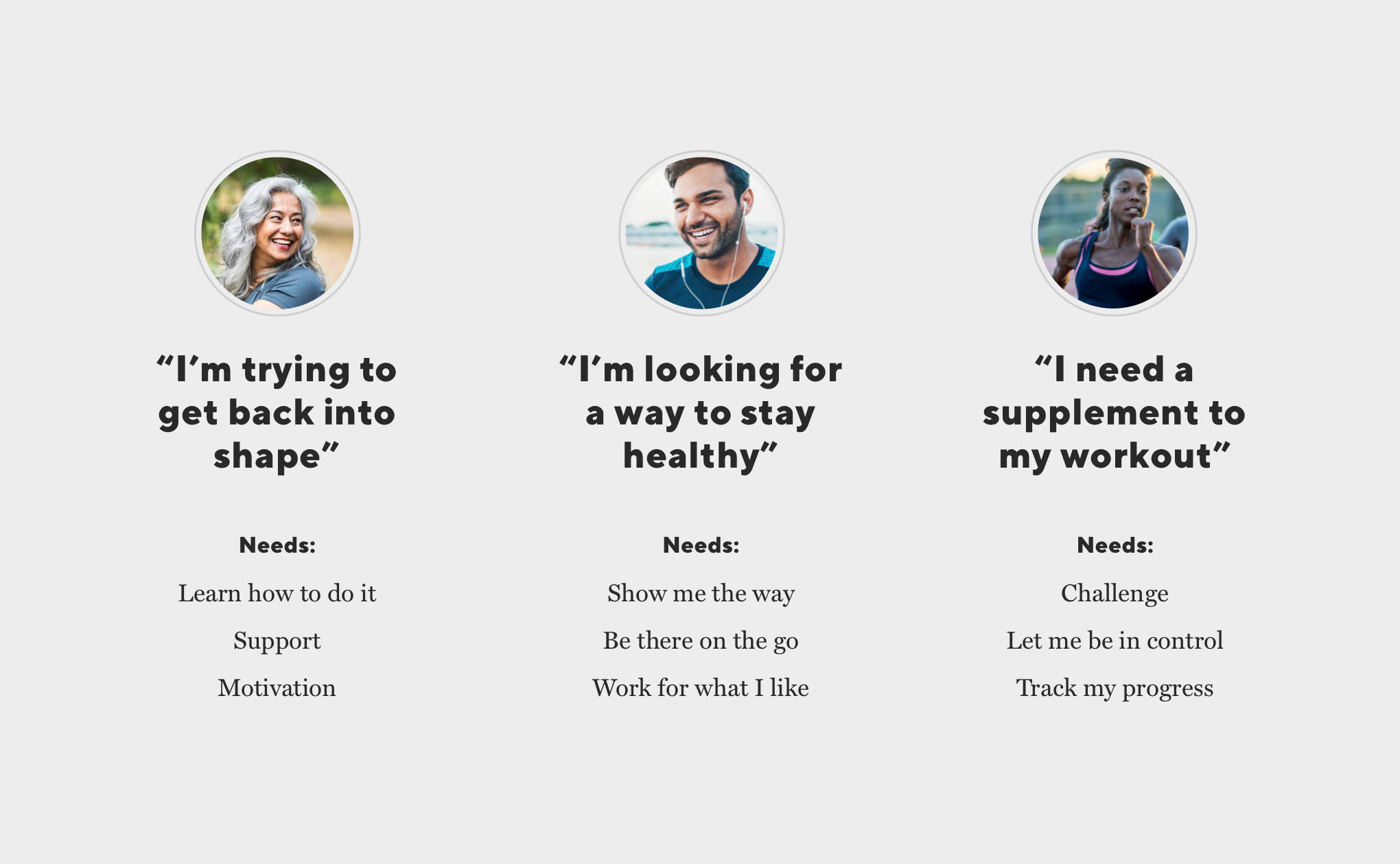
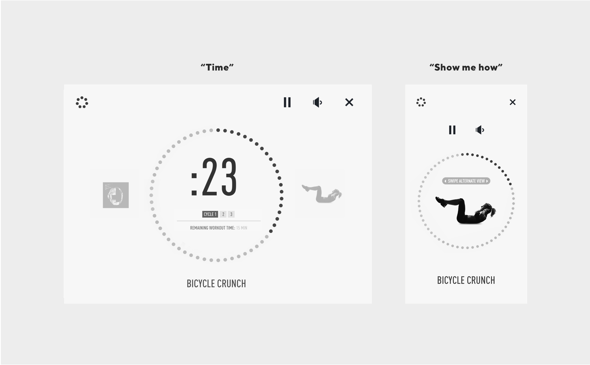
We first focused on the core of the experience–the workout flow.
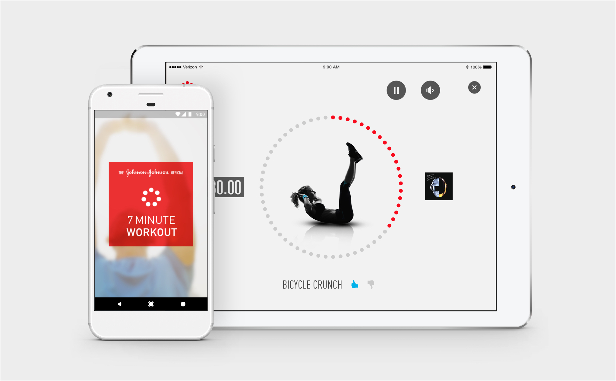
From user research, we knew the information used during exercise varied from person to person, depending on their needs and preferences. We decided to use the different types of information to create an interchangable system where users can choose the view that works best for them.
This puts the user in control, even if their needs change along the way.
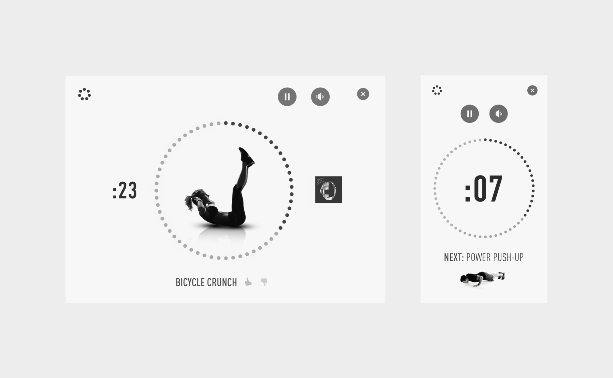
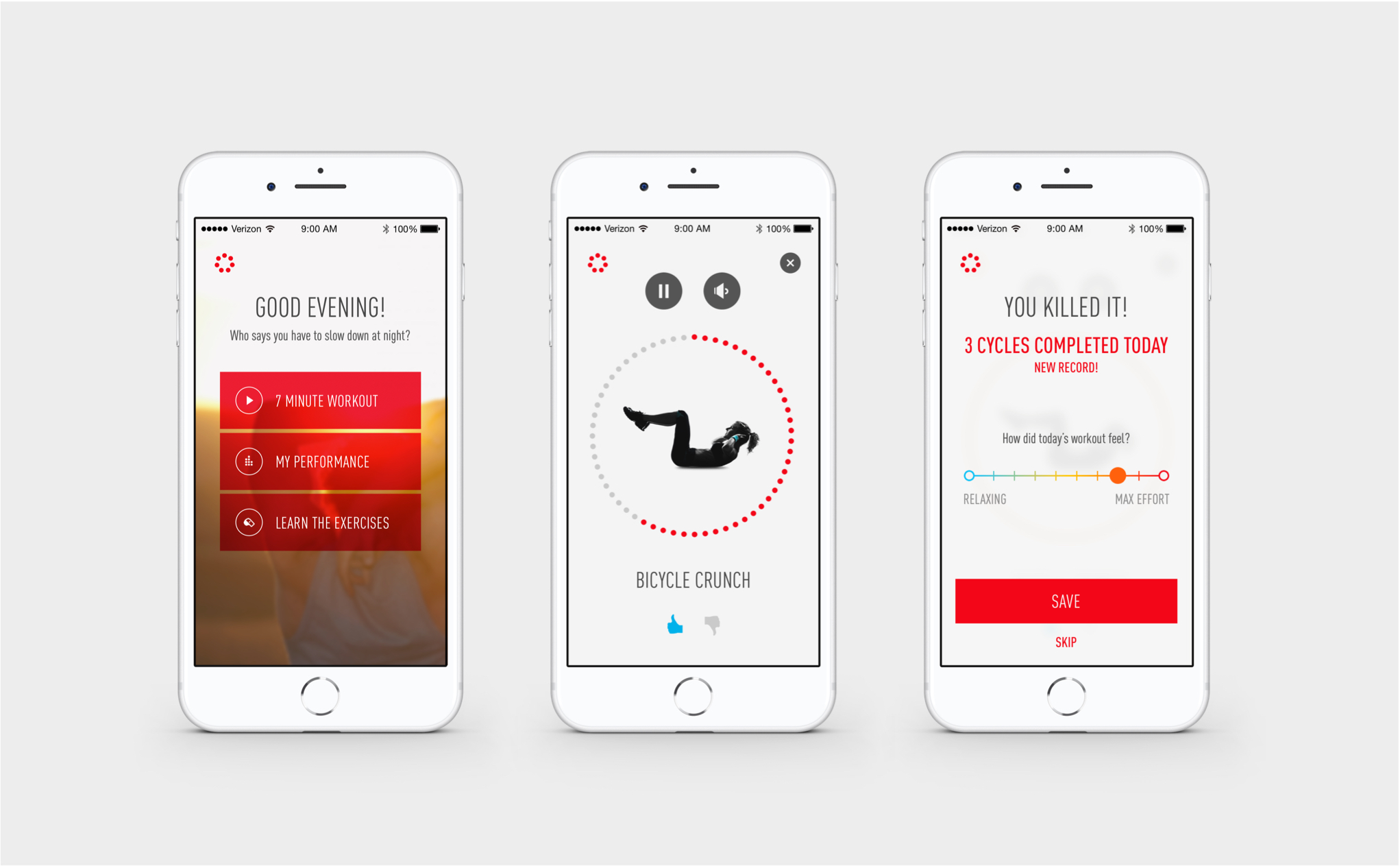
After initial user testing, we made a number of improvements, such as being able to ‘like’ or ‘dislike’ an exercise and seeing a preview of the next exercise during the rest period.
Features like these will help users stick to a routine of doing the 7 Minute Workout - the more they enjoy it, the more they will do it.
Later rounds of testing included users doing a workout while using the prototype. It was incredibly eye-opening to see the product used in its real context, and the feedback we heard gave us a lot of ideas for how to make the experience better:
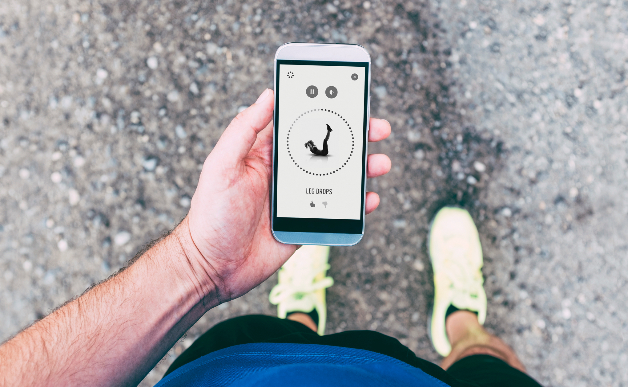
One big learning was how focused users were while doing a workout, which meant some features were not being used like we had originally imagined.
Having the same functionality outside of the workout flow can help users focus on breaking a sweat and still be able to customize their routine after. We also added a layer of auditory cues during key moments. A countdown beep during the last 5 seconds of a workout was enough of an indicator to motivate users to finish strong but wasn’t overly distracting.

Once the flow was in a good place, the visual style developed from the functional elements of the workout flow. I used bright colors for important content like the countdown timer.
The language is friendly and motivational to encourage users to give it their all, similar to a real-life workout buddy.
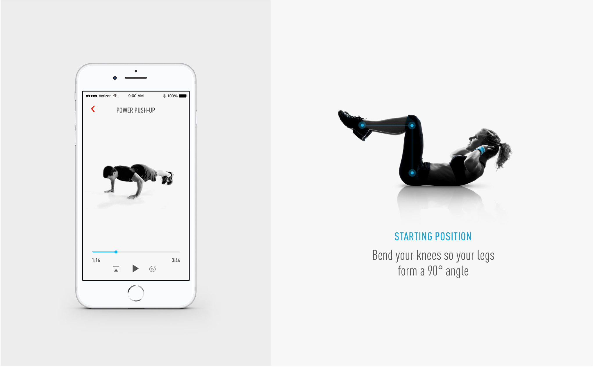
User safety was also important to consider, especially for beginners.
I designed visual and auditory cues to teach users good form. Full videos live in their own area of the app so users can learn the exercises at their own pace. A stripped-down version is shown during the workout as a helpful reminder.
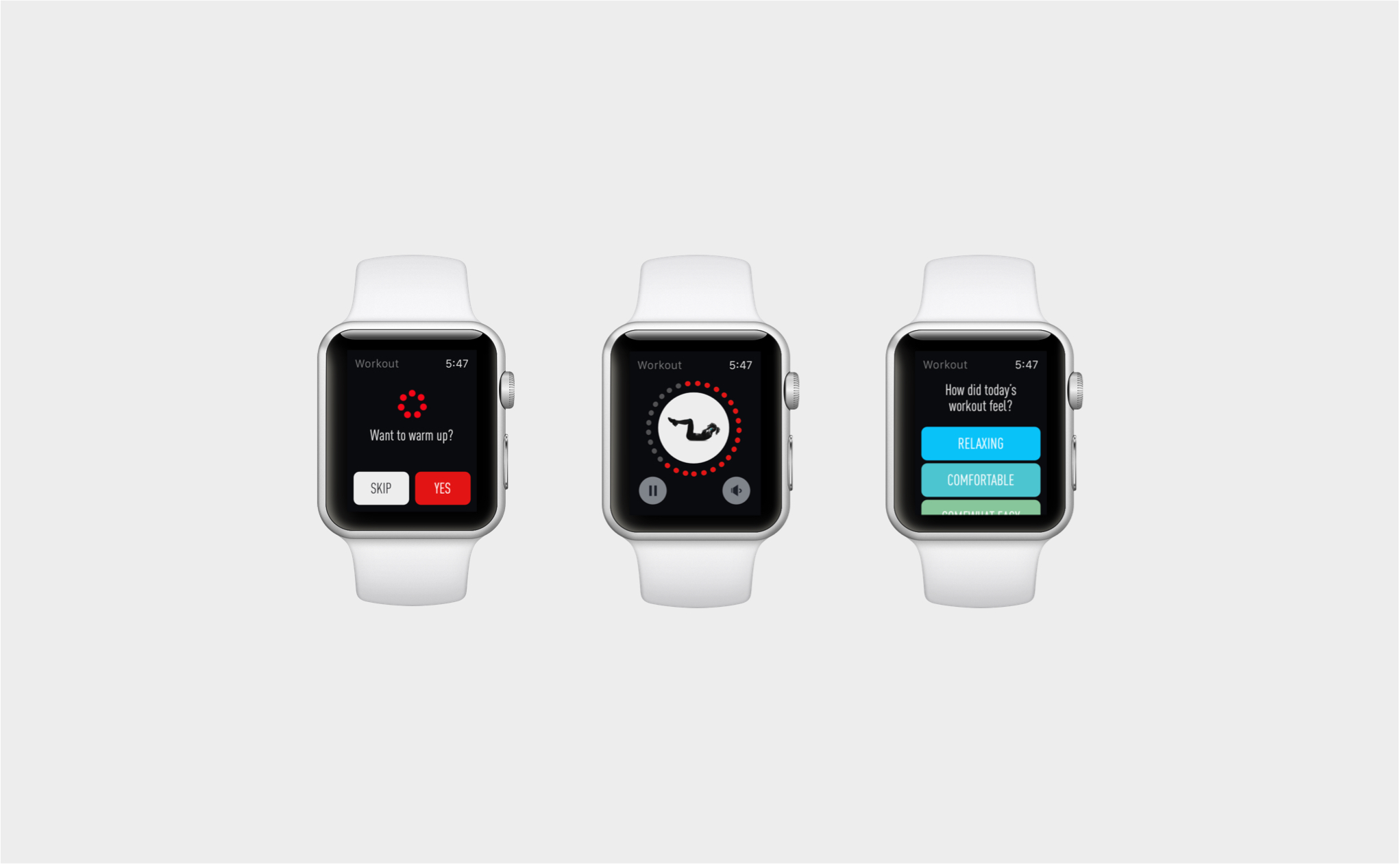
After the release of the phone app, we developed a watch experience so users can always have their workout with them on the go.
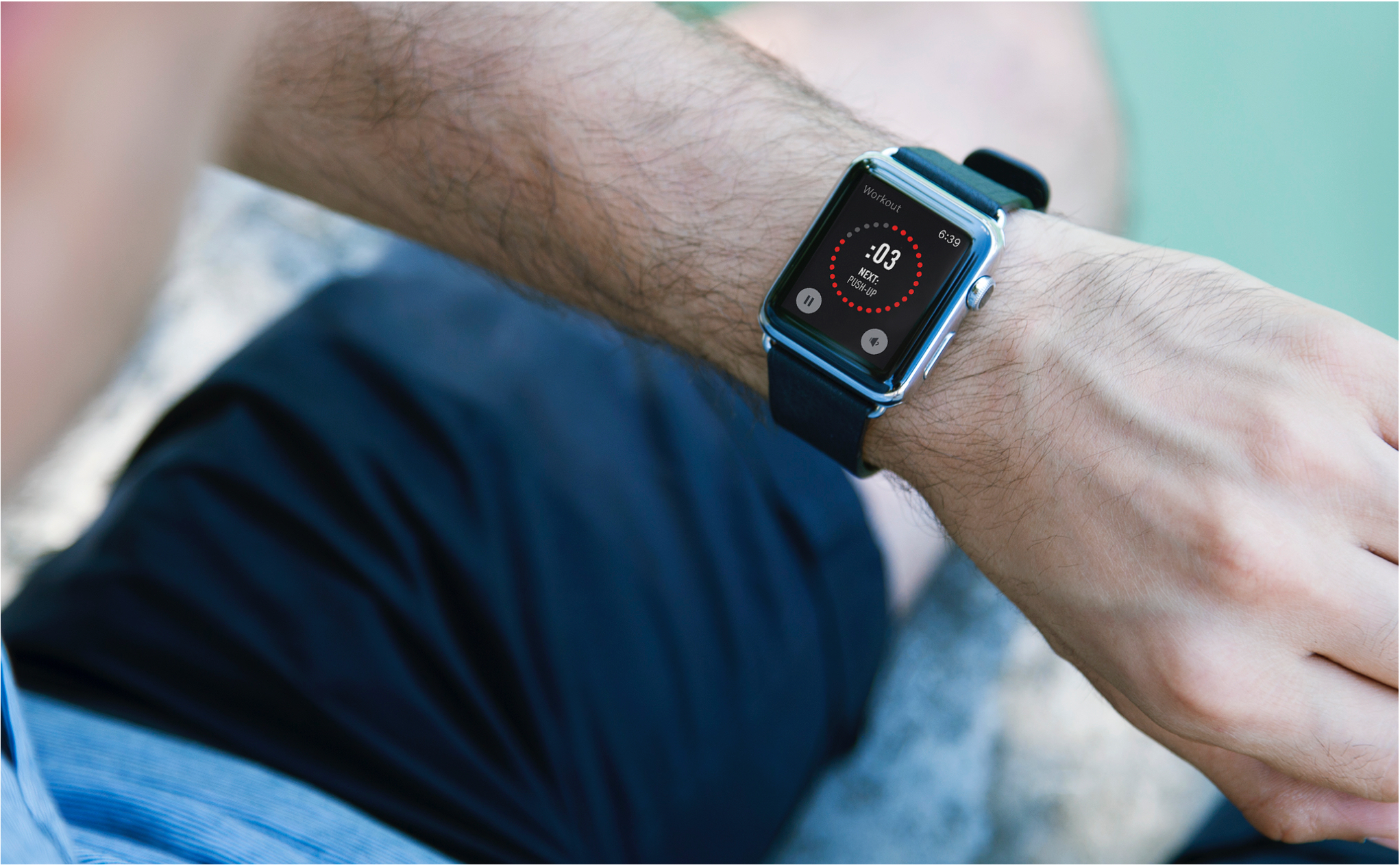
The 7 Minute Workout continues to be improved with more customization, tracking, and user preferences to better support everyone on their fitness journey.
Over
3 million people have downloaded The 7
Minute Workout.
Many users are motivated by the positive difference they’ve seen in their lives:

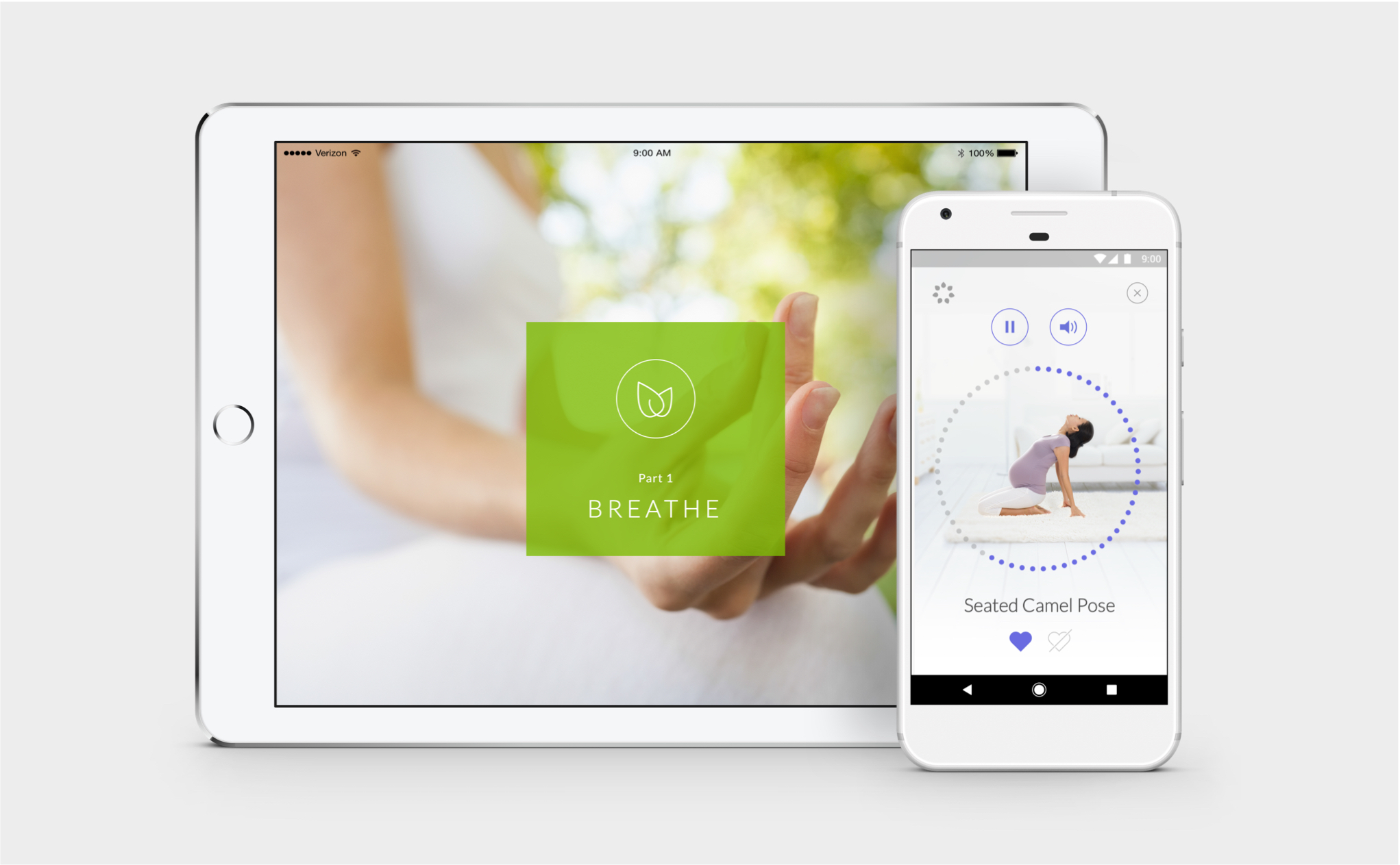
The success of the 7 Minute Workout inspired the development of the 7 Minute Wellness for New & Expecting Moms, so women can maintain a healthy mind, body, and baby during and after pregnancy:

Justin Gravante – Art Director
Steve Bush – Product Designer
Sarah Surrette – UI Designer
Chris Jordan – Exercise Physiology Director
Johnson & Johnson
Tonic Design Co. Dev & QA teams
